
We thought payment was the hard part
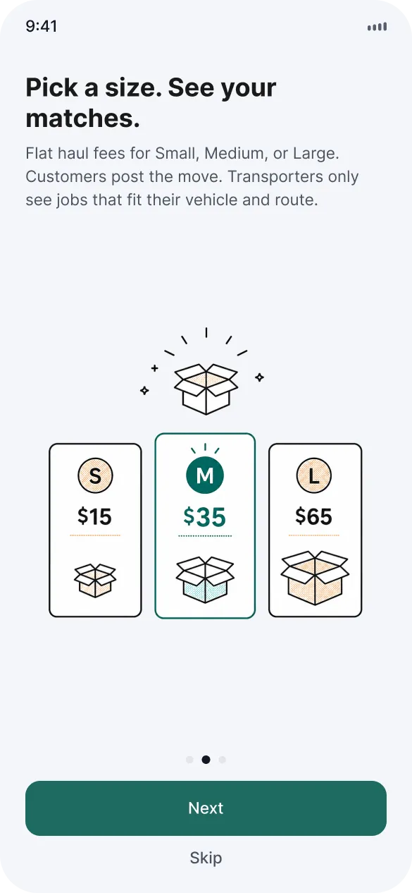
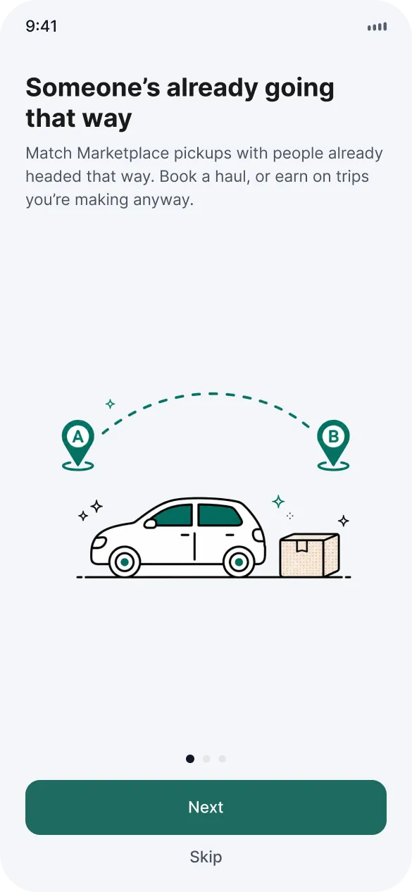
Match a Marketplace pickup with someone already driving that way. Book a haul for $15, $35 or $65 by size, or earn about $28 on a trip you're making anyway. Escrow looked like the trust fix. Pickup was the real block.
Context and role
Context
The worst part of buying bulky stuff
Pickup is honestly the worst part of buying bulky stuff on Marketplace. A couch doesn't fit in a Civic, curb meetups feel off, and coordinating it eats a weekend before someone ghosts. Almost nobody pays to fix it. People bug friends, rent from Home Depot, book a Modo, or just don't buy the thing.
We started with escrow as the hook. Holding the money until the item arrives sounded like the trust fix. Then the survey and 5 interviews came back and 88% already pay by e-transfer with no problem. Money wasn't where deals died. Getting the item home was. So the product matches the haul to someone already driving that way, which keeps the fee low enough to matter.
Role
Product, brand and most of the UI
I was lead and product owner. Product, brand and most of the UI. Ash ran the survey and interviews and helped on a slice of screens. iOS first. Corridor coverage in the Lower Mainland and BC, not city-wide.
The constraint was a two-sided marketplace that can't look busy on day one. The first screens had to work with about 3 listings on the map and still feel like something you'd book.
Numbers
Survey of buyers and sellers
88%
already pay by e-transfer
Item money was never the blocker
5
interviews
Plus a Metro Vancouver survey and a Reddit thread on moving furniture without a car
$15 / $35 / $65
haul fee by size
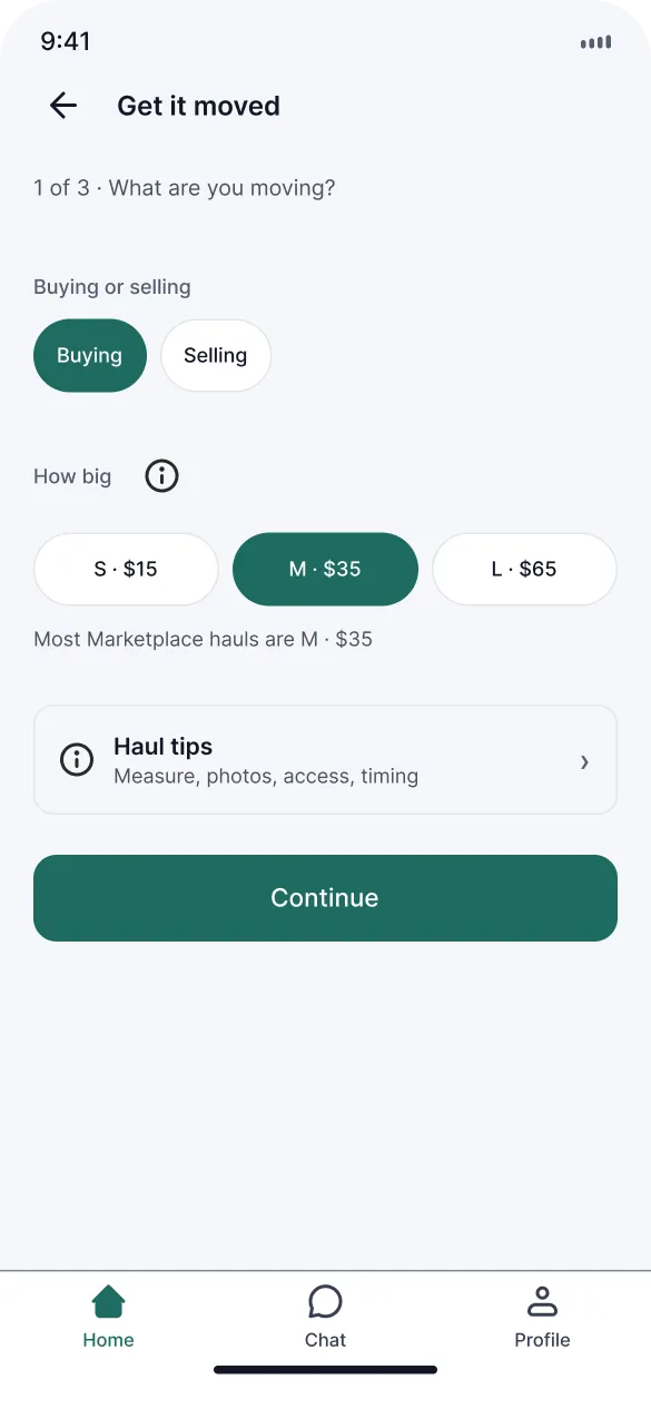
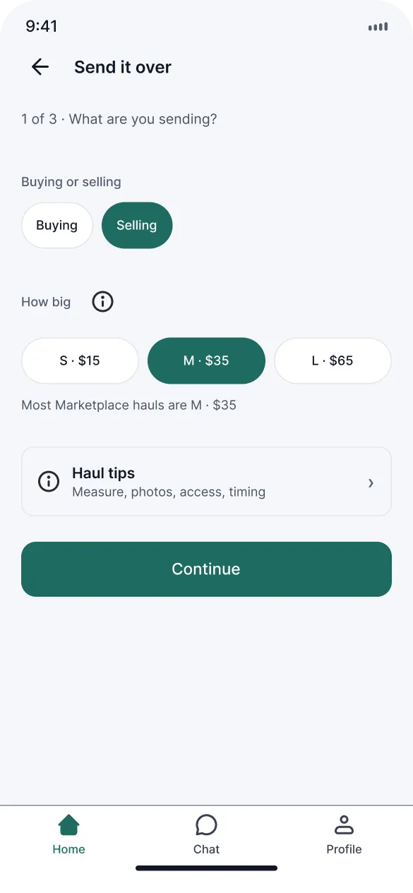
Most Marketplace hauls are Medium. Driver earns about $28 on a $35 haul.
3
matches max
Sorted by route overlap and timing first
Survey skewed toward students and people already in buy and sell groups, and surveys are noisy on willingness to pay, so we trusted what people already do over what they said they'd pay for.
Decision 01
Escrow deferred for Year 1
Escrow looked like the responsible thing to build. It also asks two strangers to trust a hold on their money before they've met, and the survey showed low interest and confusion. We deferred it for Year 1 and made the first trip a match, a time and a face. Item money stays on Marketplace or Kijiji where people already pay each other.
The escrow flow (checkout, hold, disputes) is still in the archive for later. It's just not the first thing this product should ask of someone.
Decision 02
The app matches the route, the customer never picks one
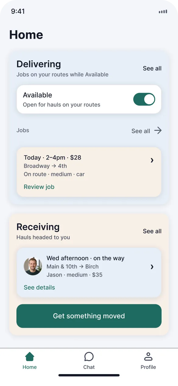
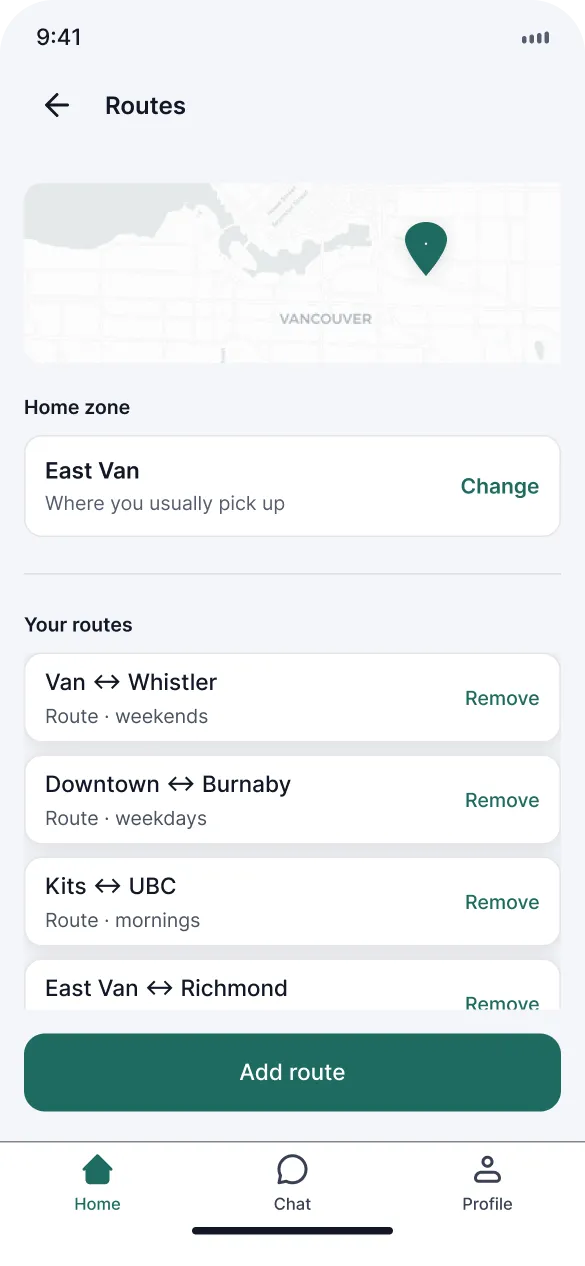
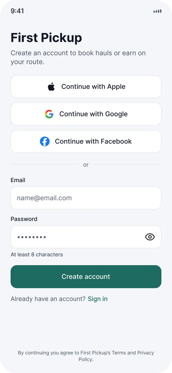
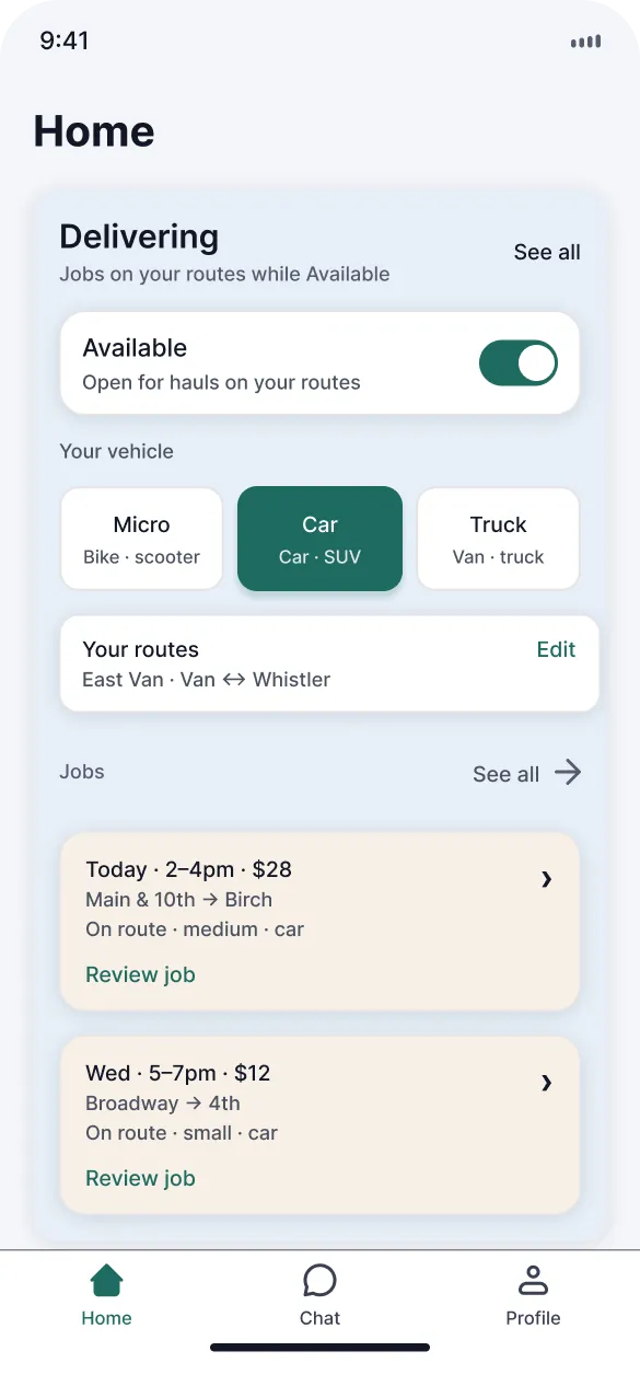
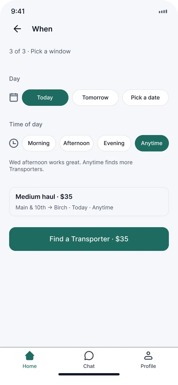
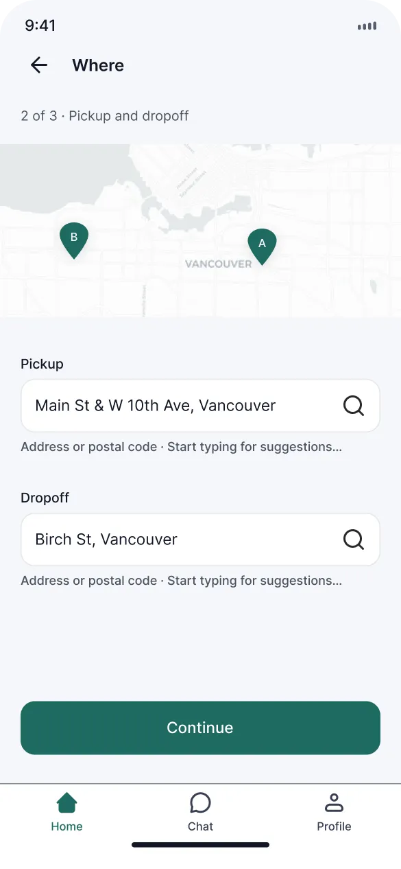
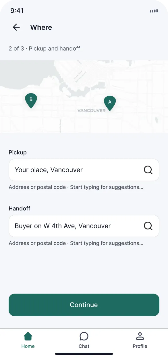
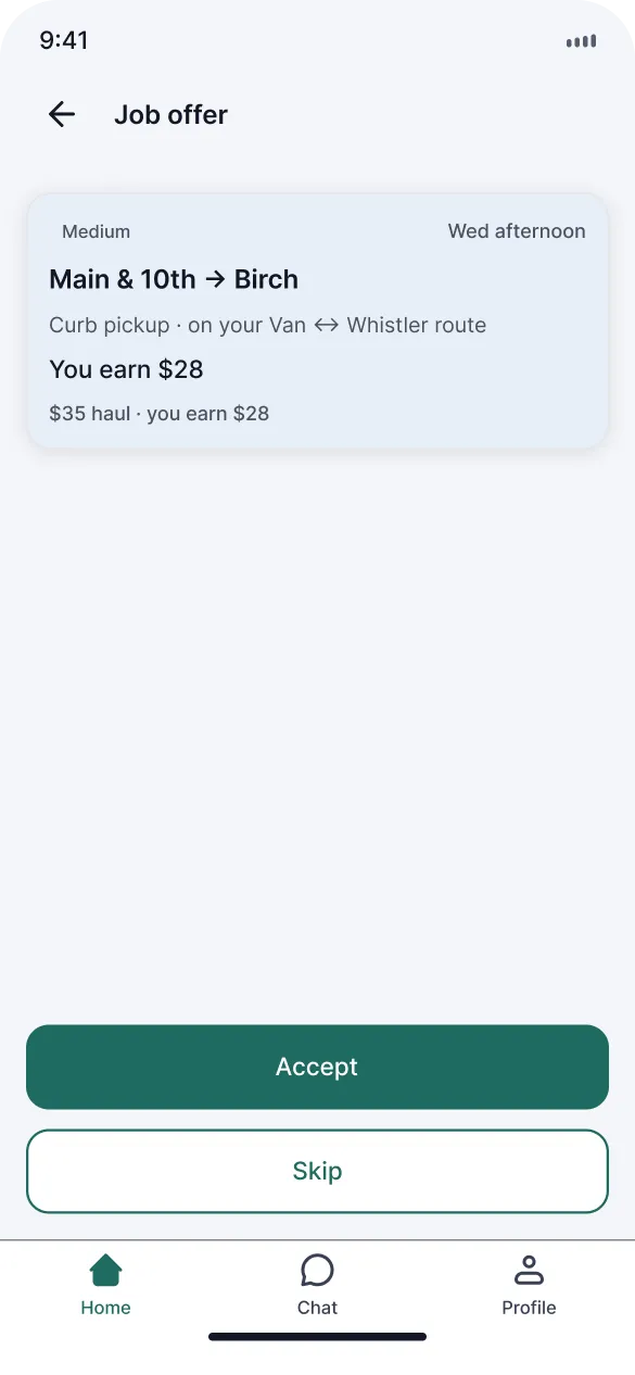
Customers never pick a route type. Mei enters pickup, dropoff, size and when, and the app matches her to transporters whose corridor already covers it. Transporters set their routes (Van to Whistler on weekends, Downtown to Burnaby on weekdays) and jobs show up on trips they were already making.
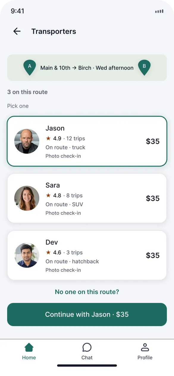
Matches are capped at 3 and sorted by route overlap and timing, with a short line on why this job fits. A long list of strangers with prices turns into haggling. The denser version with cards, filters and a busy map got cut.
Decision 03
Photos, ratings and empty states
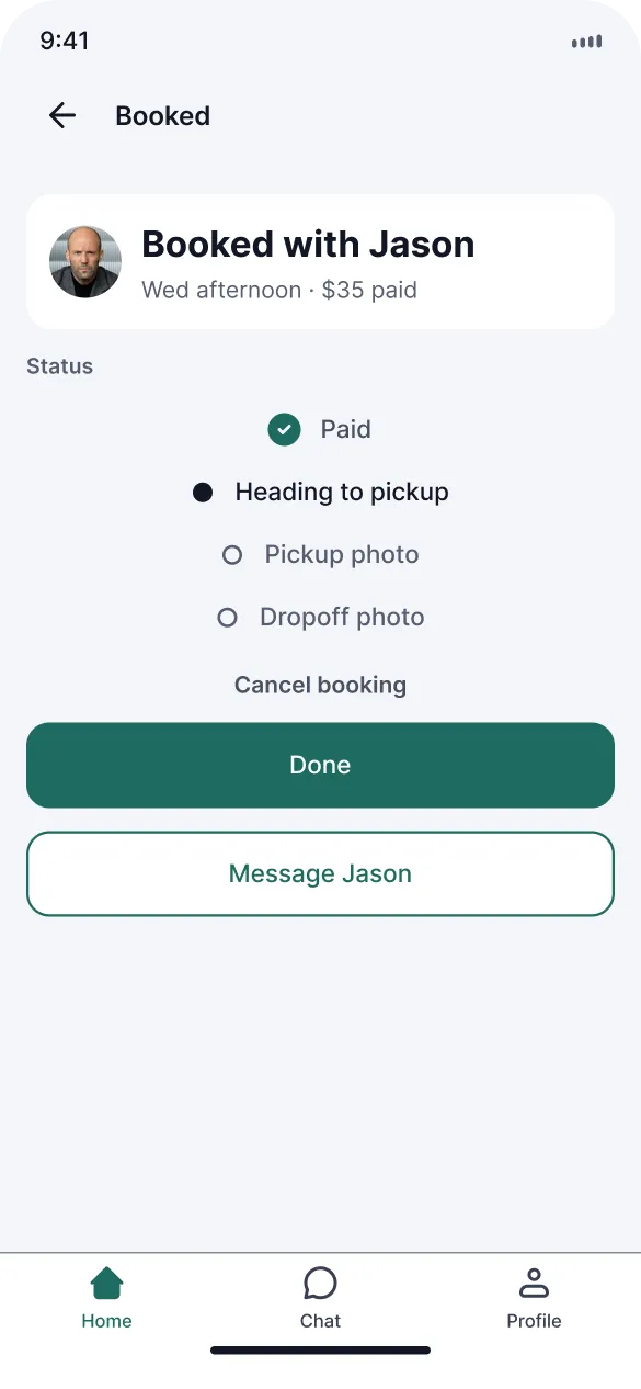
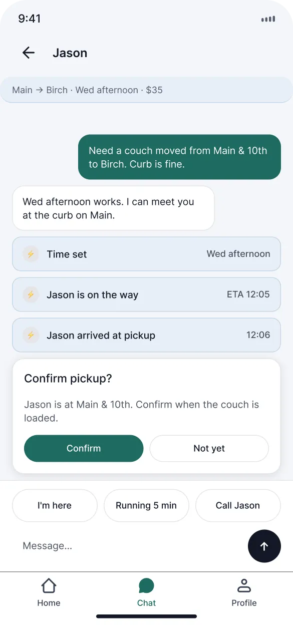
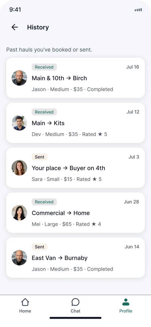
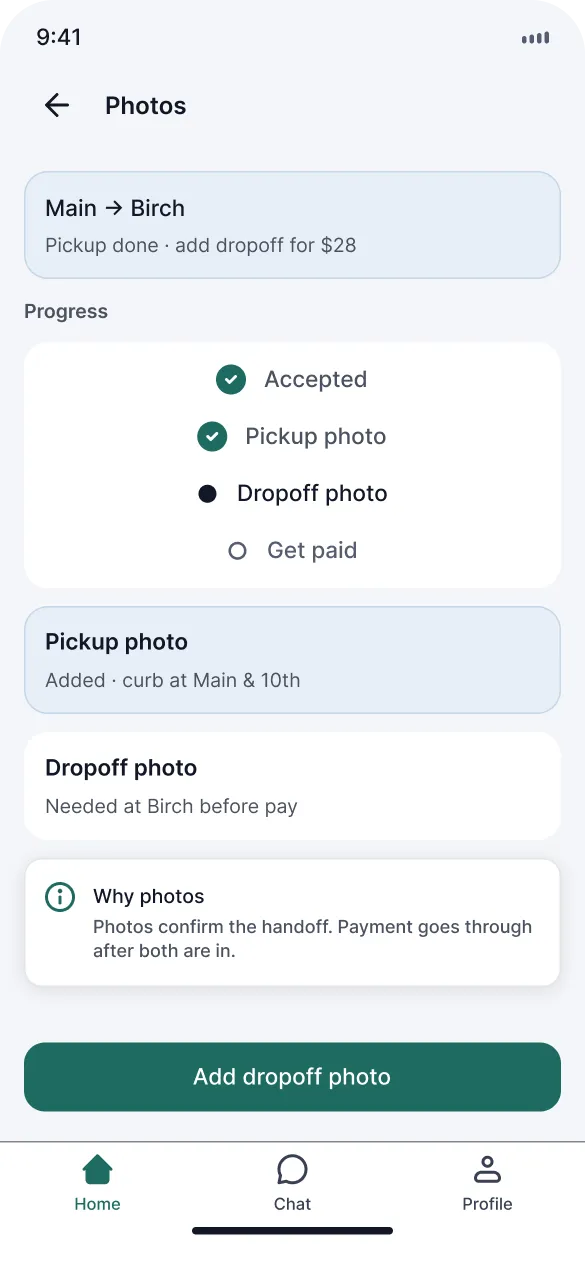
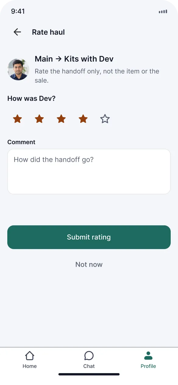
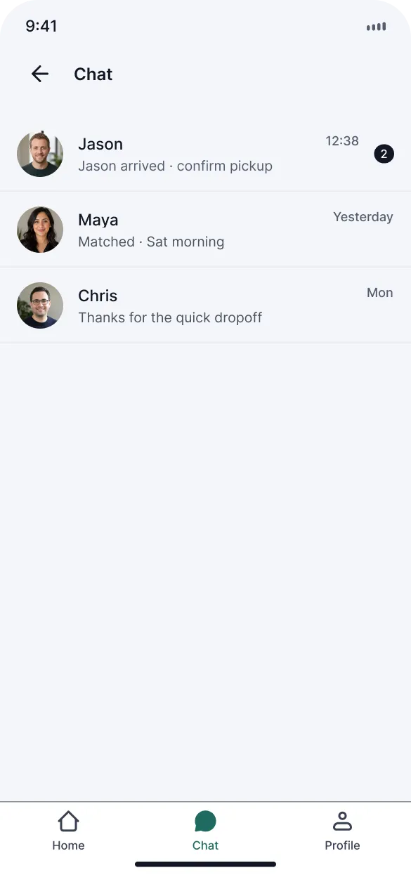
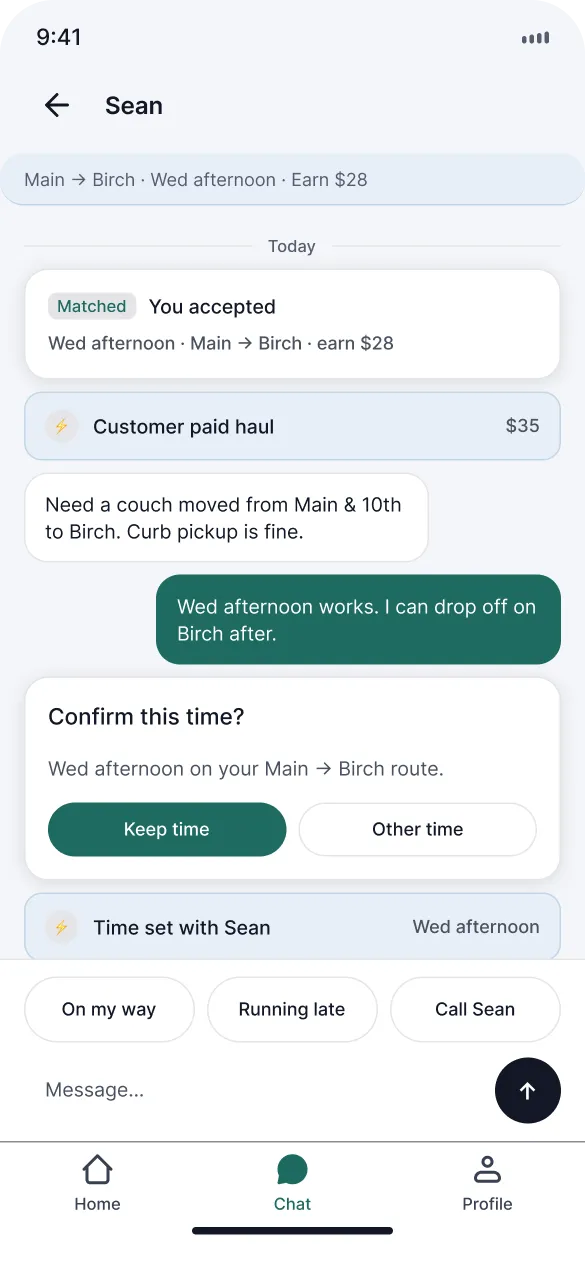
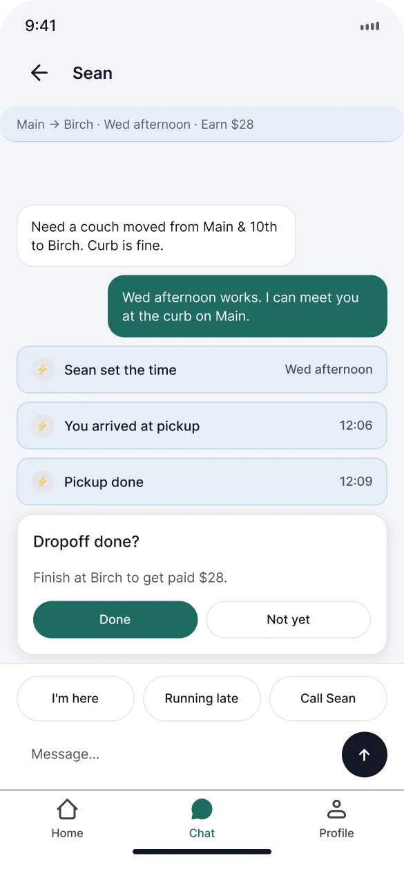
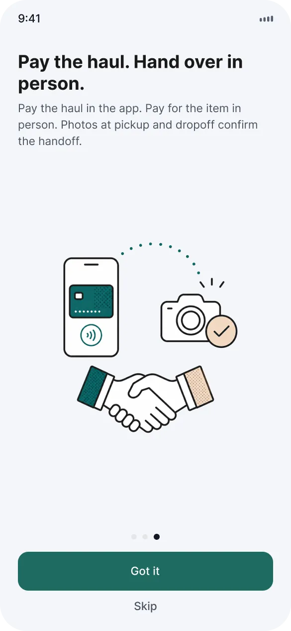
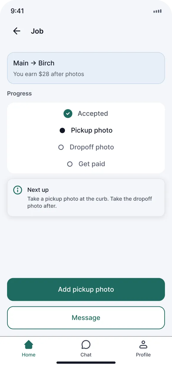
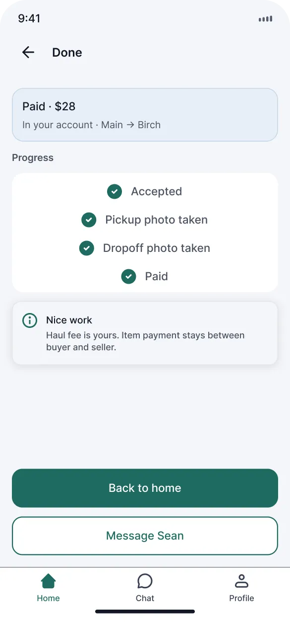
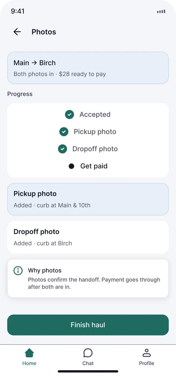
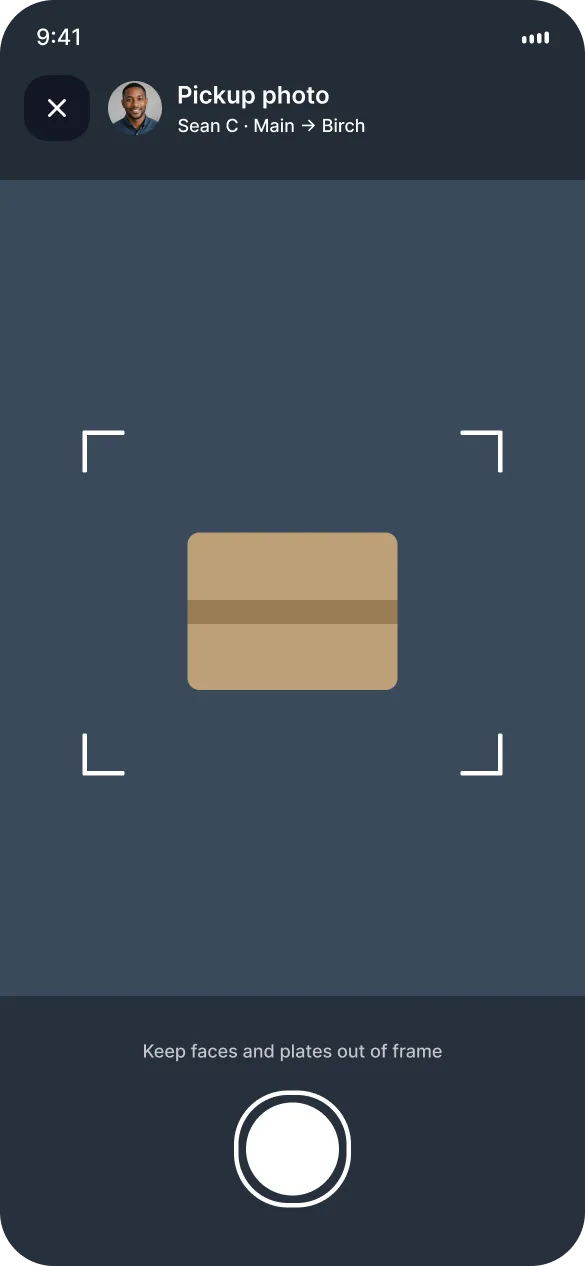
Trust comes from photo check-ins at pickup and dropoff, ratings after the haul, and a chat that only opens once you're booked. That's enough to book a first trip without a long form stack up front.
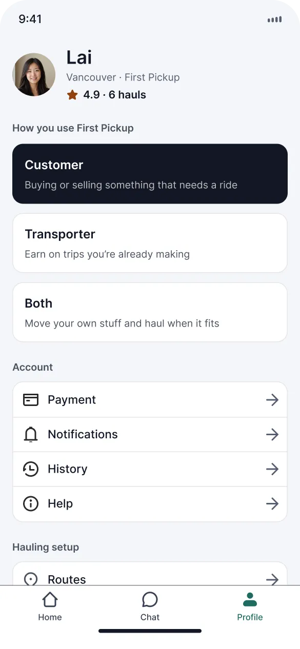
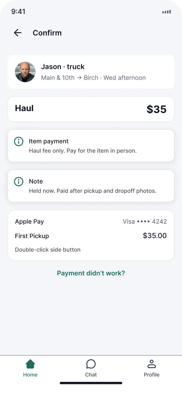
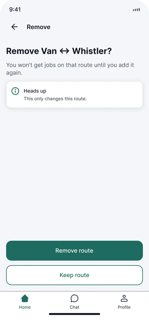
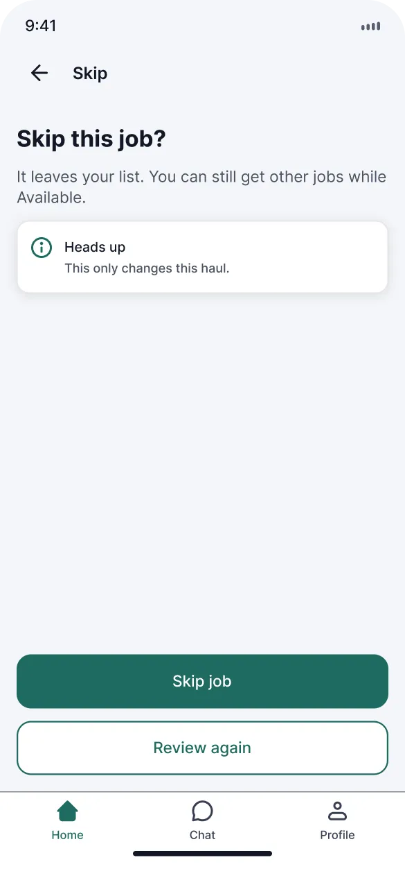
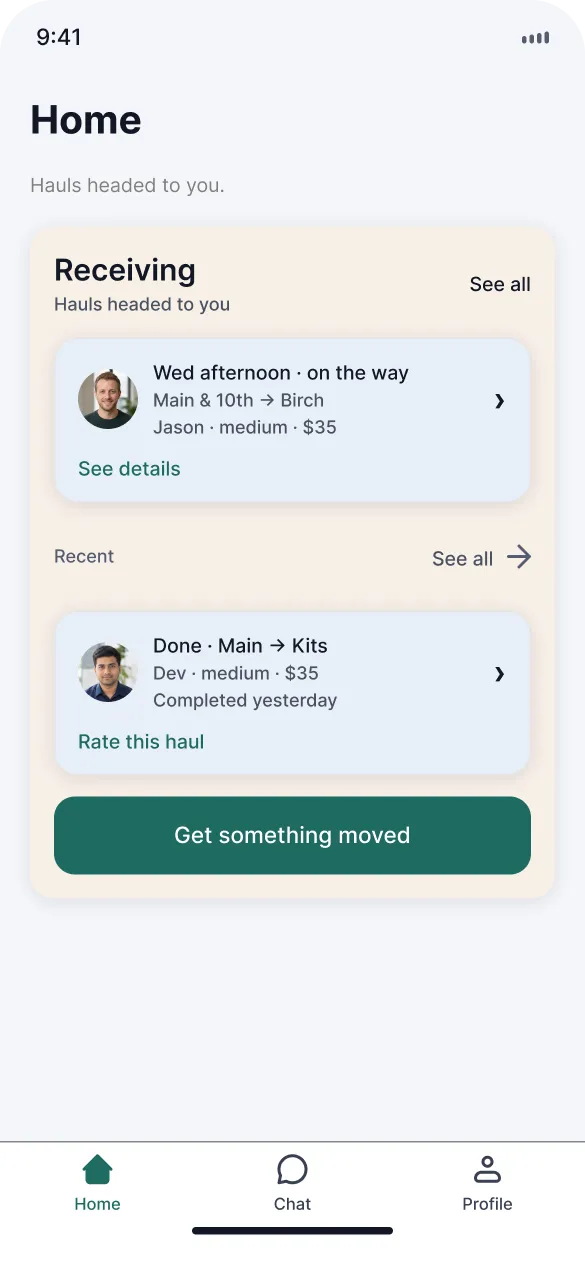
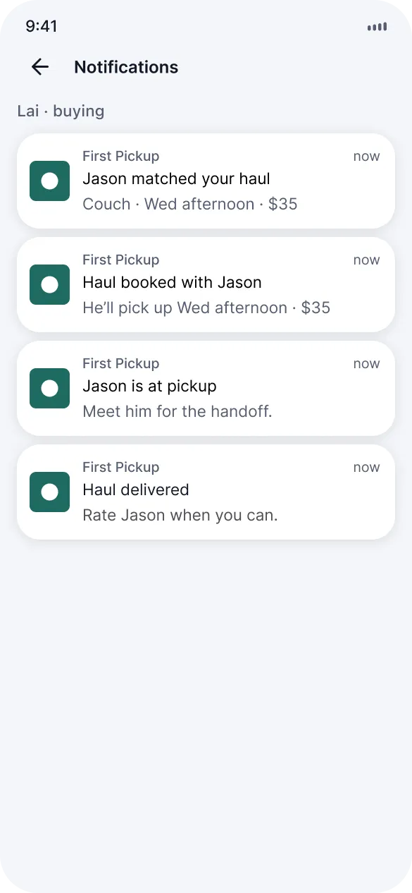
Think-aloud tests on prototype v2.5 caught the rest. Role choice was fuzzy, so onboarding got split into customer and transporter. First-time Home looked unfinished, so we added empty states for no haul, no active haul and no nearby match. Walkthroughs stalled on payment failed and cancel, so those confirms exist now. Help, history, rate haul and notification settings landed after a job. Same pass bumped hit targets to 44pt and darkened secondary text on tinted cards.
Interface shots
Account

Chat

Confirms
Home
Onboarding
Request a haul
Transporter
Trust and check-in
Outcomes
Escrow out, corridors in
First trip without escrow
Bookings work without escrow. Match, time and a face first, and the money stays where 88% of people already pay it.
Jobs on routes drivers already drive
Transporters set corridors and see only jobs on the way. About $28 for a trip they were already making, so the fee stays flat with no surge and no per-km.
Local, and tested before polish
Routes and corridors felt specific to Vancouver and BC instead of a generic delivery clone. Onboarding, empty states and error confirms all came out of the v2.5 walkthroughs.
No live users yet, so no conversion numbers. Next is formal sessions with Marketplace buyers and corridor drivers, then a couple of Vancouver corridors. Year 1 and later, look at holding item money until delivery.
Reflection
The data pushed us toward logistics
Let research kill the first idea. Escrow was neat and pickup was the pain, and the survey made that obvious pretty fast. The other lesson was to walk empty and error states before polishing the happy path, because that's where every tester stalled. Safety still matters, and escrow still sounds useful later, but it's not the thing you lead with.