
A one-page site for partnership work
Brand, design system and a one-page site for Jess Head, a caregiver and patient-family partner, built in about a week on the SKC cms kit and live at jess.skc.works while the final domain waits.
Context and role
Context
One page that explains the partnership work
Jess works with healthcare, child-health and rare disease organisations as a caregiver and patient-family partner, across board and advisory roles, research, education and advocacy. She needed one place that explains that work to people who might bring her in, and points them to LinkedIn and email.
The brief was a simple one-page site for a good cause, where LinkedIn stays the full career history, and the calls to action are Work with me, Get in touch and LinkedIn, with no booking language. Nothing was invented, so roles, training and talks only appear once Jess has confirmed them. It is WCAG 2.2 AA in light and dark, checked on every build, and it ships as static HTML with self-hosted fonts, almost no JavaScript, and content in JSON so it can move to a CMS later.
Role
Brand, system, build and launch
Solo on brand, design system, build and launch from 28 September to 2 October 2026, as an Astro static build on the SKC cms kit, with Cloudflare Workers and content as JSON. Jess owned the copy she confirmed and the roles that ship.
Decision 01
Full-bleed editorial page
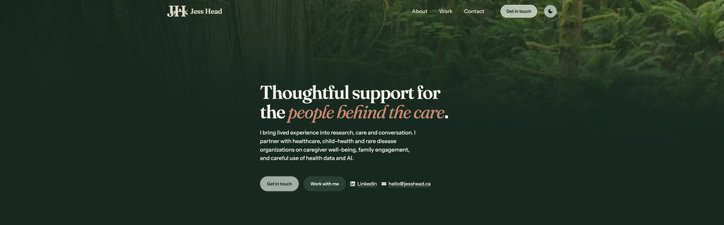
The first pass copied a reference site's structure, with a notched photo pocket, theme chips and pathway links, and the same day it became a full-bleed editorial page, with a photographic hero, a fixed glass bar and sticky section heads that pin while the copy scrolls. I locked that direction on 29 September.
Type settled on Fraunces for display and Instrument Sans for body, with soft forest greens, cream paper and one terracotta accent taken from hometown forest photos that run as the hero and the photo bands. About continues the hero's forest, so the top of the page stays with that photo.
Decision 02
Her 30 September review
Jess reviewed the first version on 30 September and asked for refinements, so we used her words where she had given them, kept LinkedIn as the full chronology, and added no new nav item for the new content.
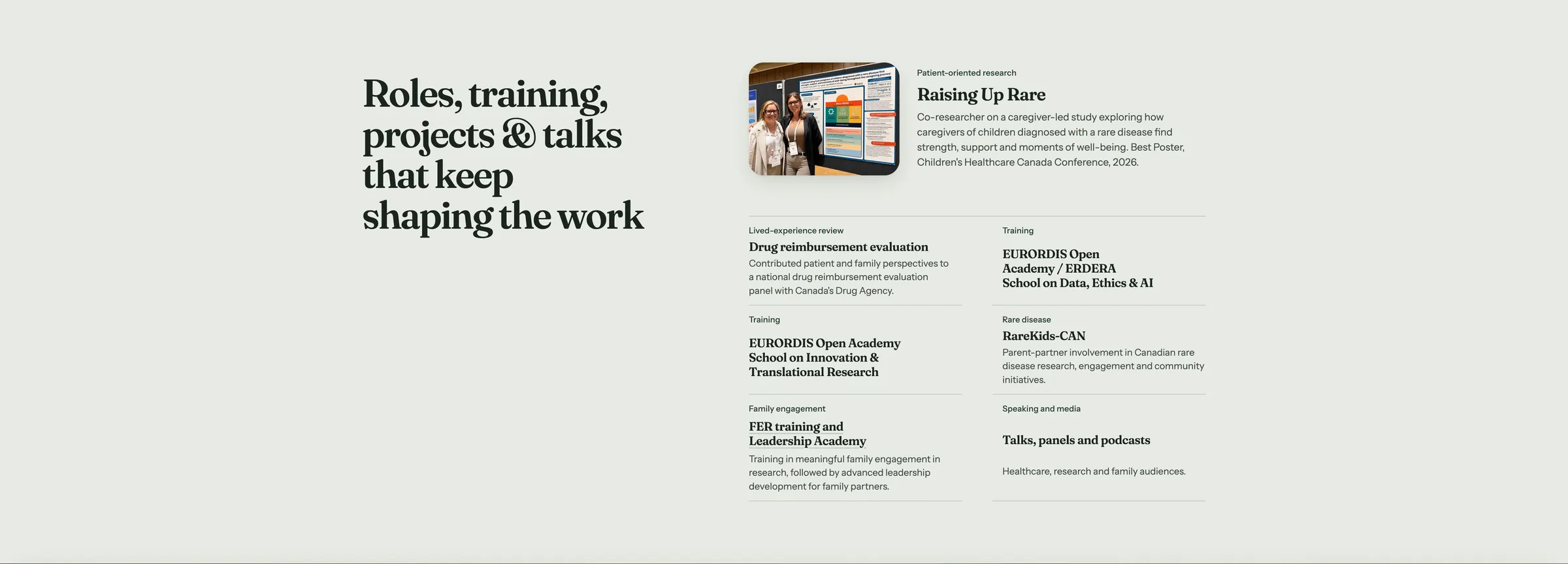
We dropped the conference line under the hero buttons, led the partnerships band with her lived-experience lede, renamed a strength to Research, education and advocacy, cleared a roles heading that repeated itself, and split a combined row so RareKids-CAN and the two EURORDIS schools stand alone. Her Raising Up Rare copy shipped the same day, including Best Poster at Children's Healthcare Canada Conference, 2026, and Media & Articles sits before Contact, with the published address hello@jesshead.ca.
Interface shots
Desktop

Outcomes
Shipped and tightened with her review
Live on the preview host
jess.skc.works went live with a green build gate for contrast pairs, landmarks, one h1, plain punctuation in copy, and a floor on the stylesheet. Draft flags are off everything she confirmed.
Design system from the polish
The polish that followed both briefs became a design system, with one 4px spacing scale, every colour as a light and dark pair, a glass system with real blur, and a build that fails if contrast drops. The reference lives at /design on the site.
Two marks and equal credential chips
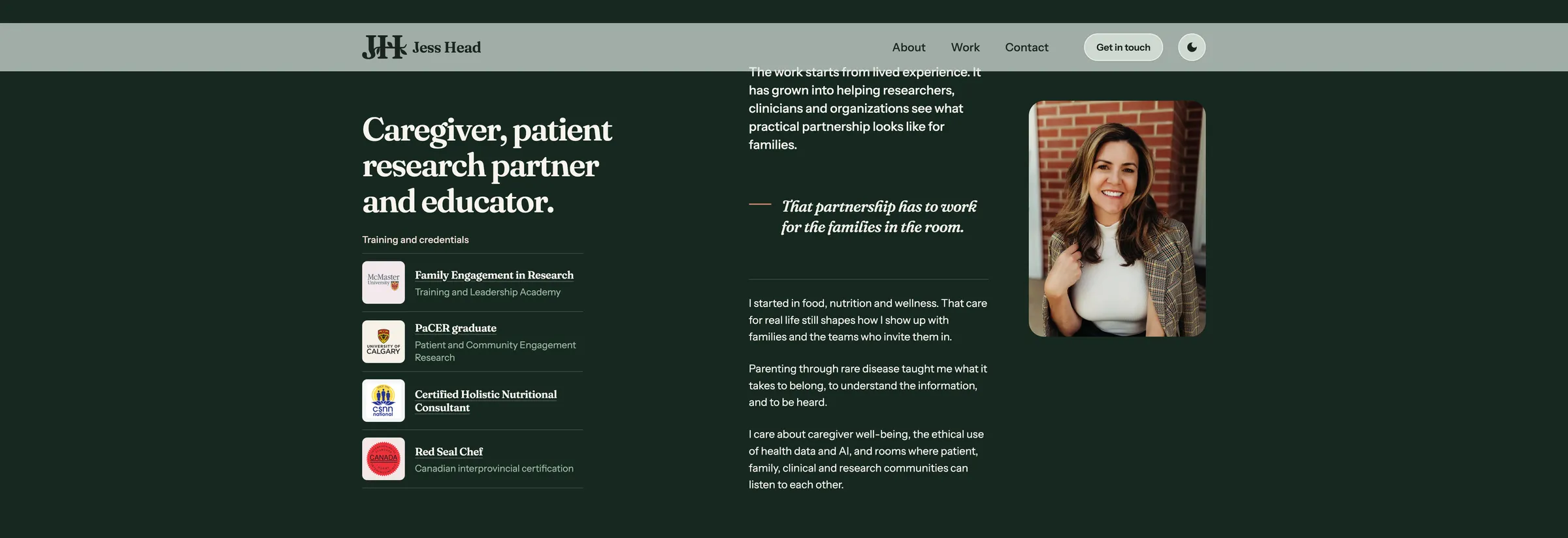
Brand stays two marks only, the Fraunces wordmark and a Fraunces JH monogram on a rounded square, and credentials sit on equal chips so each logo stays sharp.
There are no traffic numbers yet, because analytics waits for the final domain, and the site's own domain is still to come.
Reflection
Her feedback as a second brief
The useful part was treating her feedback as the second brief, and once her sentences were in, the copy was hers and the layout work could stay put. I wish the phone menu keyboard gaps and a few contrast spots had been caught before launch, and those are on the follow-up list.