
Live arrivals and saved routes on the first screen
BrainStation UX final, summer 2021. Real-time arrivals and saved routes on Home, and a transfer-heavy Vancouver trip you can read at a glance.
Context and role
Context
Too much app for the next bus
Transit apps are common and most of them are bloated. The people I talked to didn't want more modes or another settings screen. They wanted the next bus and the routes they already take right there when they open the app.
I interviewed 3 people, ages 25 to 28, a cook, a server and a copywriter. 2 of 3 found their apps confusing and 2 of 3 wanted real-time. One line stuck, "I just want to know when I'll get to where I'm going. I don't really care about most features." Another rode the same route 90% of the time and still had to dig for it every morning.
Role
Research, testing and visual design
Solo project. UX research, usability testing and visual design over 10 weeks, July to September 2021, for the BrainStation UX Design final. I used TransLink-style bus numbers and SkyTrain names so a trip to Granville Island looked like the system people already ride.
The constraint I set myself was attention. Show the next bus and the places people already named, keep it readable while standing on a sidewalk, and stop adding screens.
Numbers
Research and testing
3
interviews
Ages 25 to 28
2 of 3
wanted real-time
And found current apps confusing
4
usability testers
On the hi-fi prototype
10
weeks
July to September 2021
School project, so recruiting was hard. 3 interviews and 4 usability testers over 10 weeks is what I could get, and it was enough to change the design in a few real ways.
Decision 01
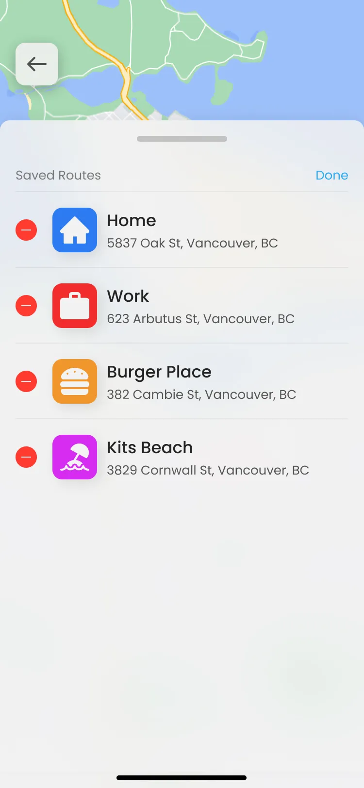
Real-time and saved routes on Home
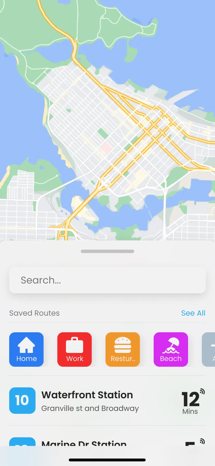
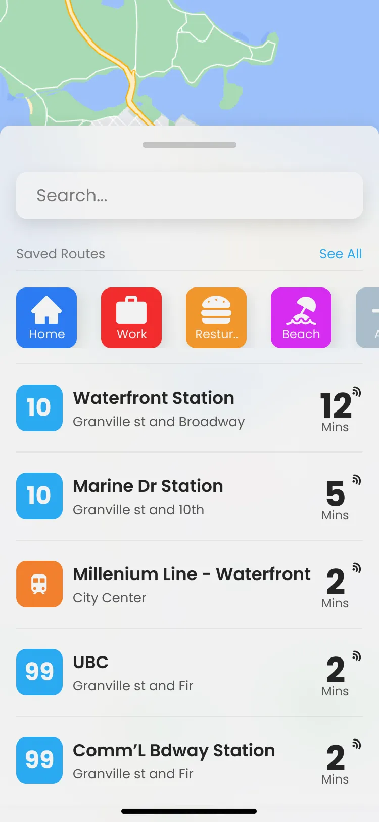
Interviews came down to live times and the routes you already take, so that's Home. A map, search, saved places and a live list of what's leaving near you. Waterfront in 12 minutes is on the first screen, with no feature tour in the way.
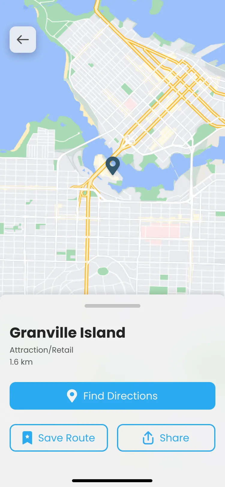
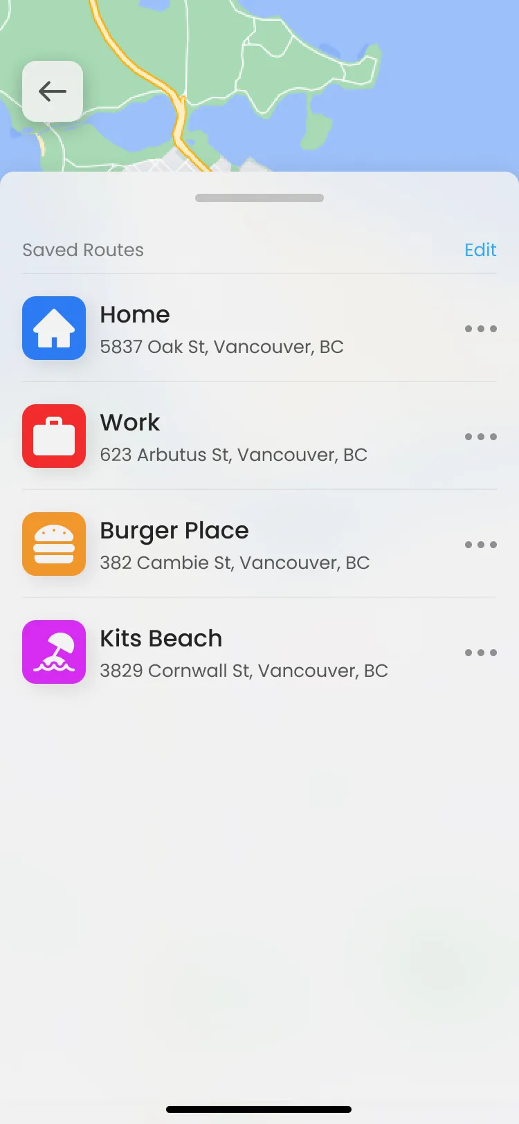
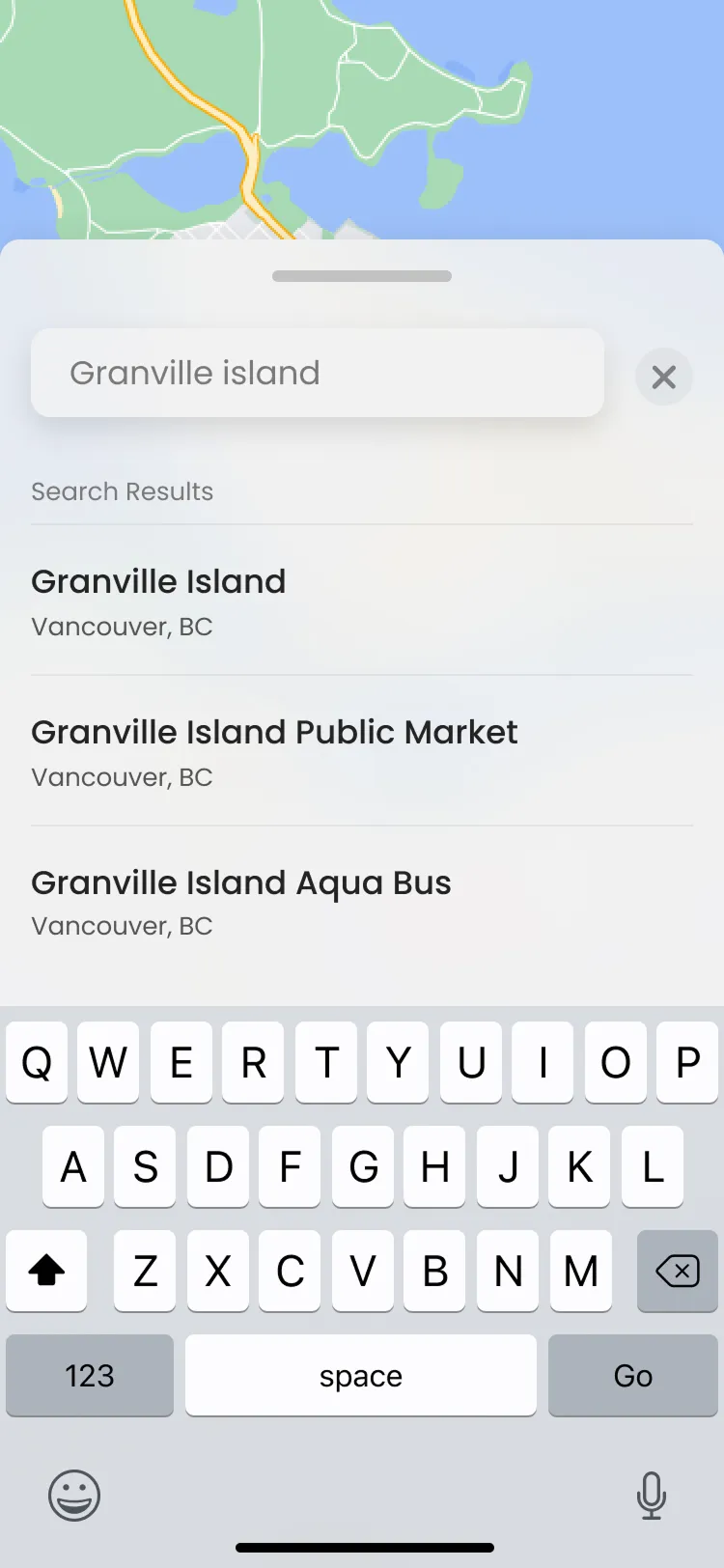
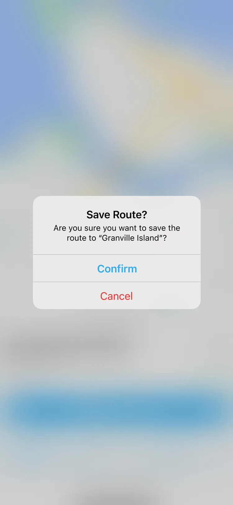
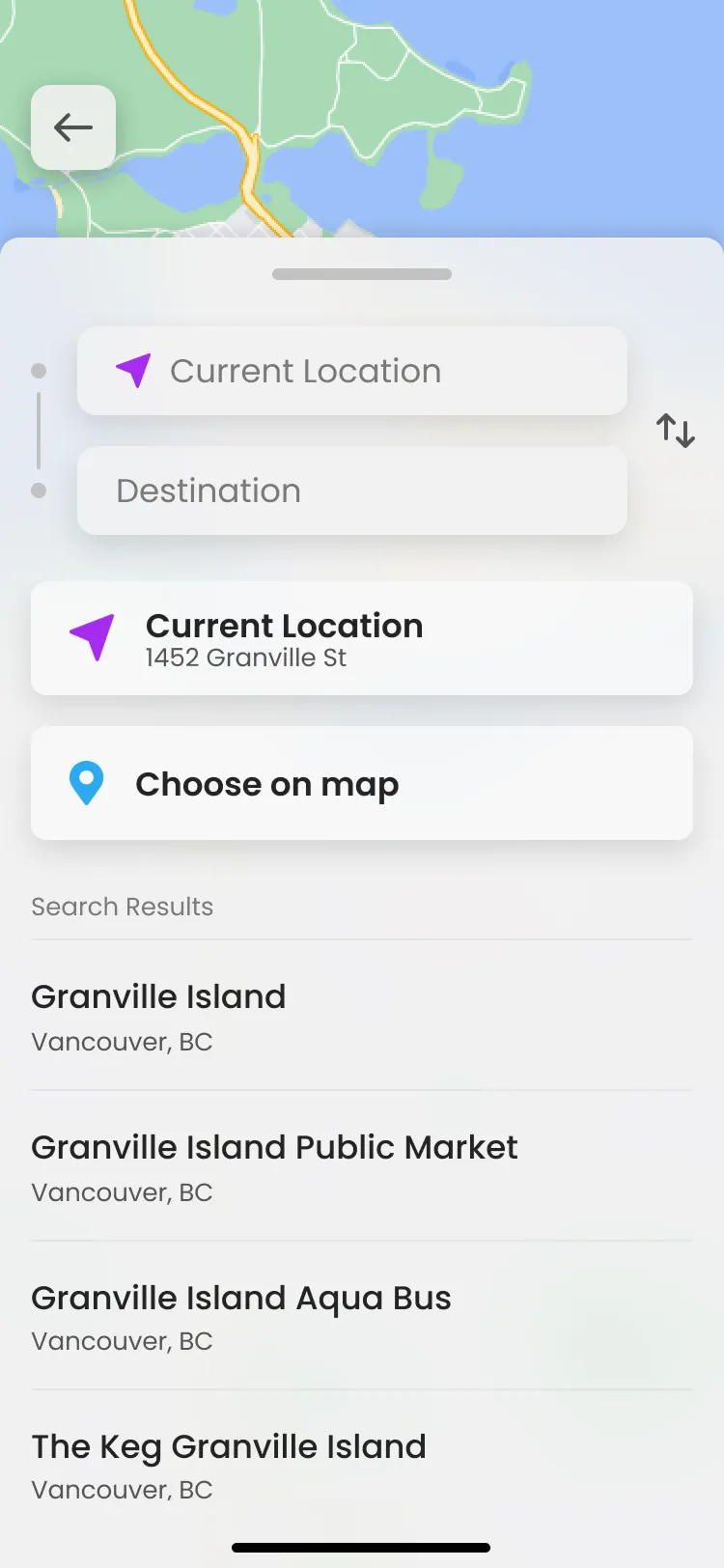
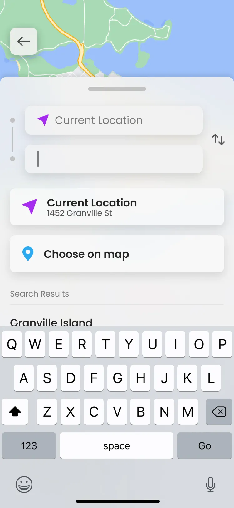
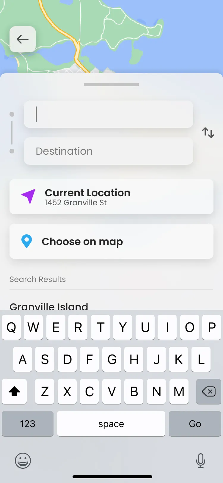
Search is one tap away. Pick a spot on the map or choose from results. Once you've saved a place it shows up as a shortcut, so the second open already knows where you're probably going.
Decision 02
Route cards you can read in one glance
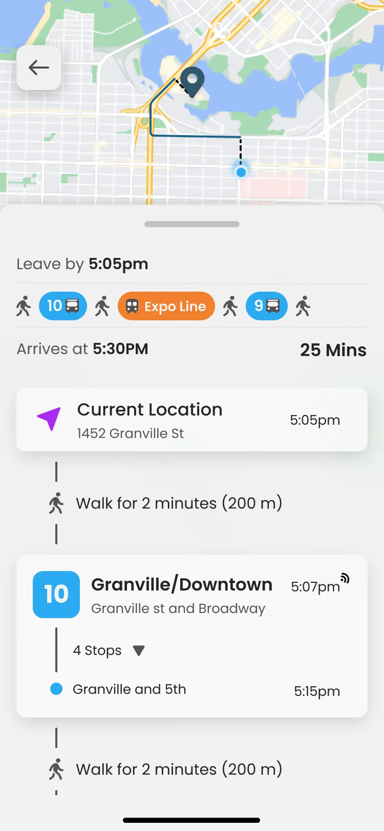
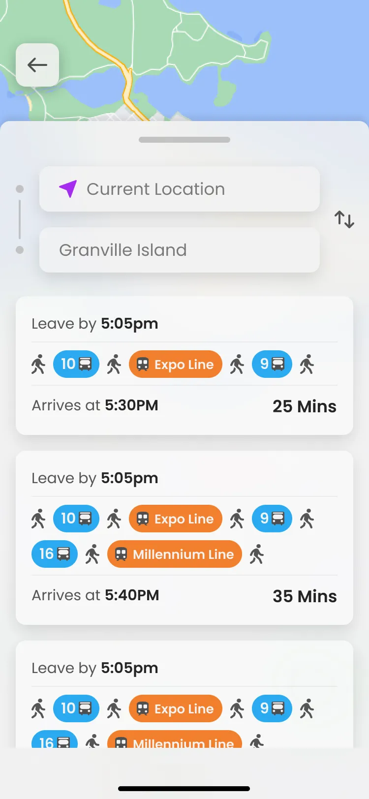
The first route cards used a row of same-size colour squares for each leg. Testers couldn't tell a bus from a SkyTrain and the row scrolled sideways. I changed buses to numbered blue pills and SkyTrain to named orange pills (Expo Line, Millennium Line), bumped contrast, and dropped the scroll so the whole trip fits on one line. Leave by 5:05, arrive 5:30, 25 minutes.
The detail screen keeps that summary, then lists the steps, walk, the 10, the Expo Line, the 9. Testing also caught the close button. I'd used an X to match Apple, but people thought it would dump their whole search, so it became a back button. Once a trip is picked, origin and destination drop off and the steps get the space.
Decision 03
Three onboarding screens, skip on all of them
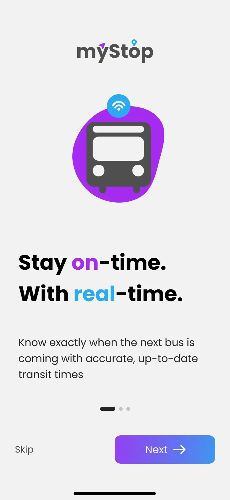
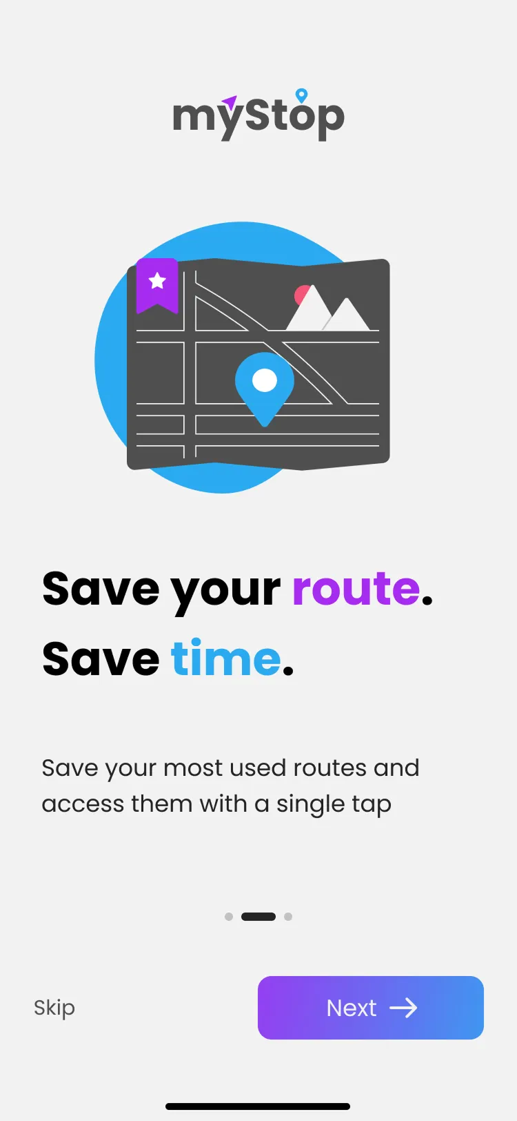
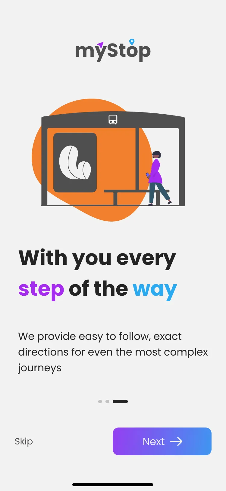
Onboarding is 3 screens. Stay on time with real-time, save the route you already take, and get directions for a messy transfer. Skip is on every screen. It names the 2 things people said mattered and then gets out of the way.
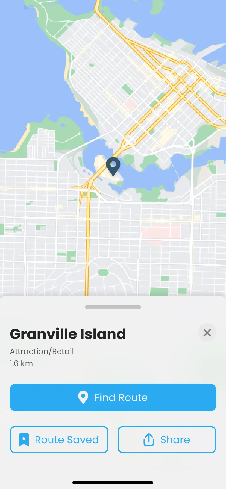
If I had more time I would have spent it on another round of usability testing and on the location selected screen, not on more onboarding. Settings and a user panel can wait until the trip flow is right.
Interface shots
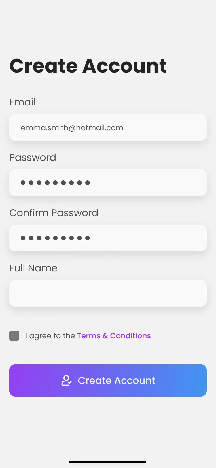
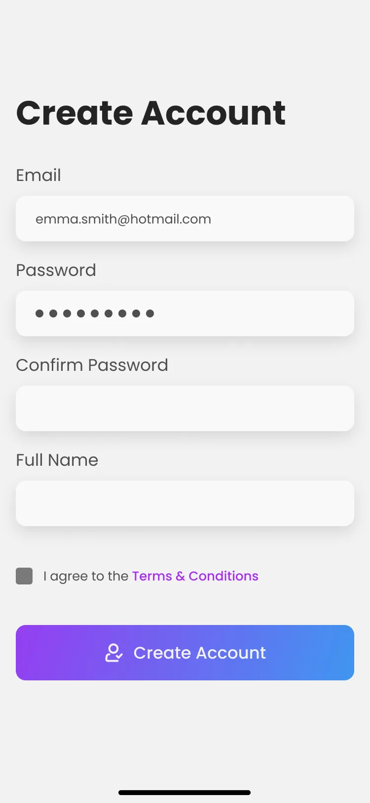
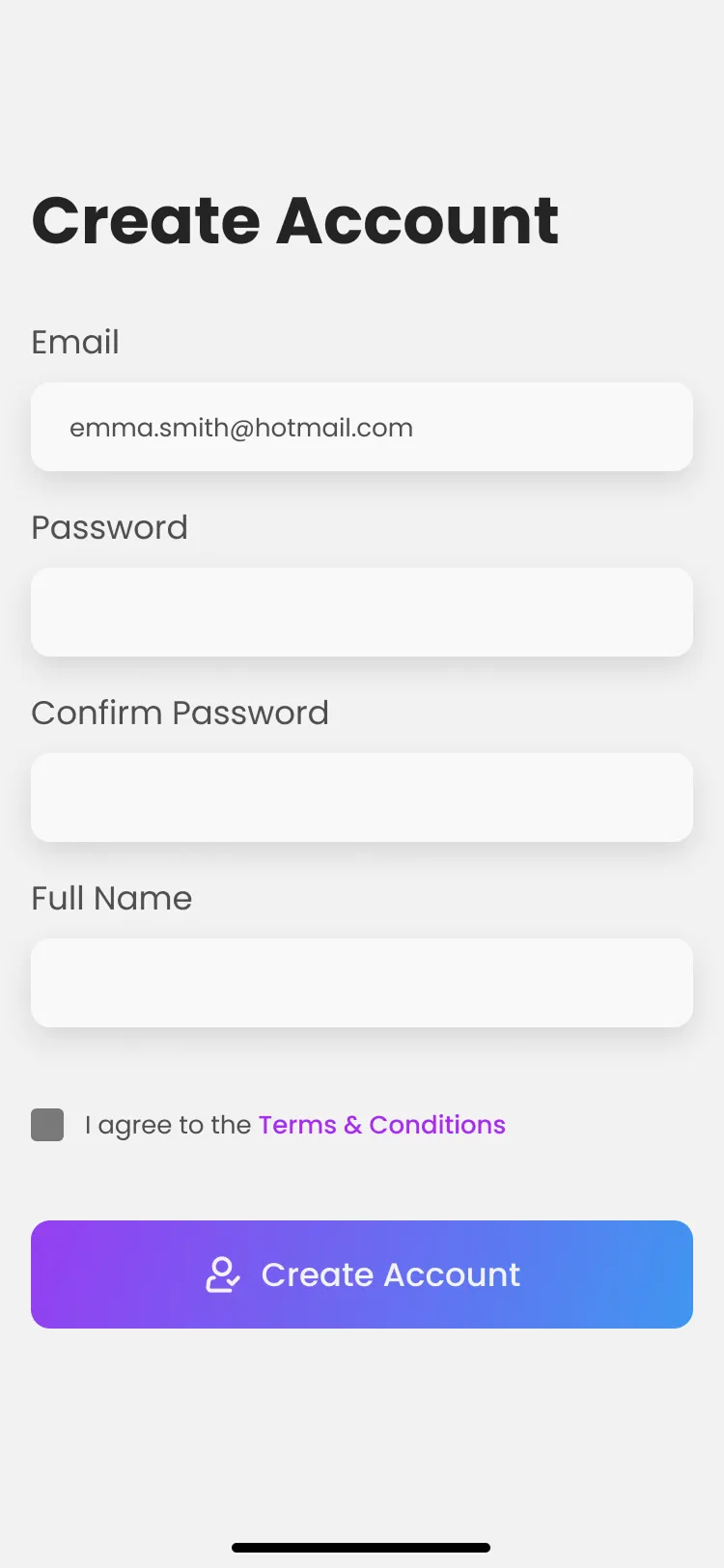
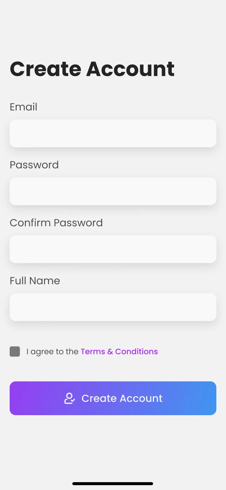
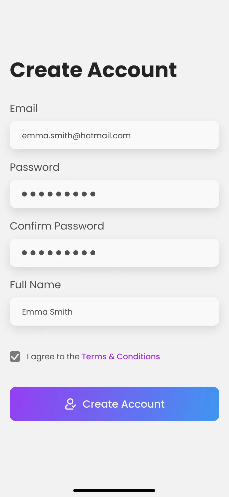
Account


Home
Location
Onboarding
Routes
Saved routes
Outcomes
Back button, pills and one-glance cards
Home shows live times first
Saved places and real-time arrivals are on the first screen. You don't have to go through a plan-a-trip flow to see when the next bus is.
Named bus and SkyTrain pills
Bus numbers and SkyTrain names replaced a scrolling strip of colour squares. A trip with two transfers reads on one line.
Back button instead of an X
The X on the route sheet read as cancel everything. Testers expected a back button and a trip screen without the search fields still sitting there.
Class project, so no launch numbers. Next I'd measure time to first saved route, Home opens for live times versus search, and whether the trip summary is enough without the step list.
Reflection
The location selected screen still needs work
Biggest takeaway was how much data and testing change a design. Sketching, IA, interviews and usability testing all moved this in ways I wouldn't have guessed. With more time I'd do another testing round, finish the location selected screen, and build settings. There's also a long list of small UI tweaks I missed or didn't get to.