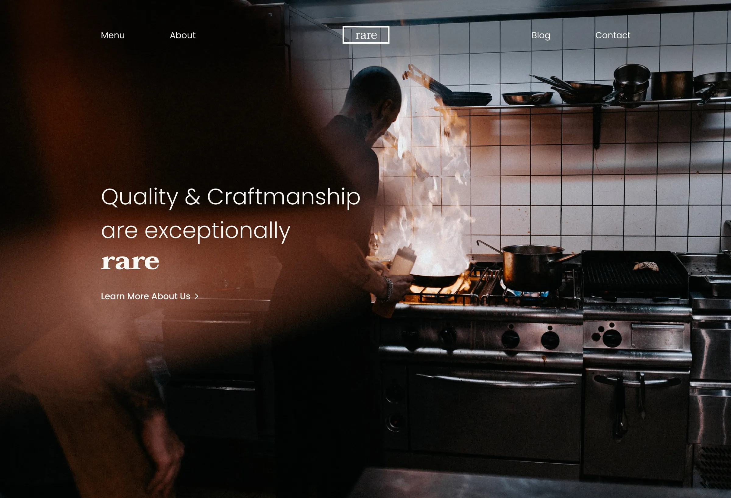

An upscale restaurant site that's still easy to read
BrainStation UI final, 2021. A semi-upscale restaurant site with a small style guide, double A contrast and pages you can read on a phone.
Context and role
Context
A restaurant site people can scan on a phone
BrainStation UI Design final, August to October 2021. The brief was a site for a fictitious semi-upscale restaurant with a menu, specials, reservations and ordering. I also wanted a blog for recipes, specials and events, since a restaurant site mostly gets opened once.
I had 3 informal chats with restaurant managers I knew from work and a competitor pass on Autostrada, Earls, Cactus Club and Di6mond. Same pattern everywhere. People check on a phone first, hunt for hours and the address, and leave when the type is hard to read. Priority one was easy to read and digest. Elegant was allowed only if it didn't cost any of that.
Role
Solo visual design and brand
Solo visual design over 10 weeks. Brand wordmark, colour and type, sketches, wireframes, hi-fi for desktop and mobile, and Figma prototypes for both. Competitor pass on 4 Vancouver hospitality sites. No developer partner and no real client.
This sits next to myStop from the same BrainStation year. That one was the UX course. This one was UI and brand for a multi-page restaurant site.
Numbers
Interviews, competitors and the 12 screens
10
weeks
August to October 2021
12
hi-fi screens
6 pages at 1440 and 390
6 + 2
colours and typefaces
Taviraj and Poppins
4
competitor sites
Autostrada, Earls, Cactus Club, Di6mond
School project, so no live traffic and no booking numbers. What's left is the style guide, the 12 screens and a clear list of what I'd do differently.
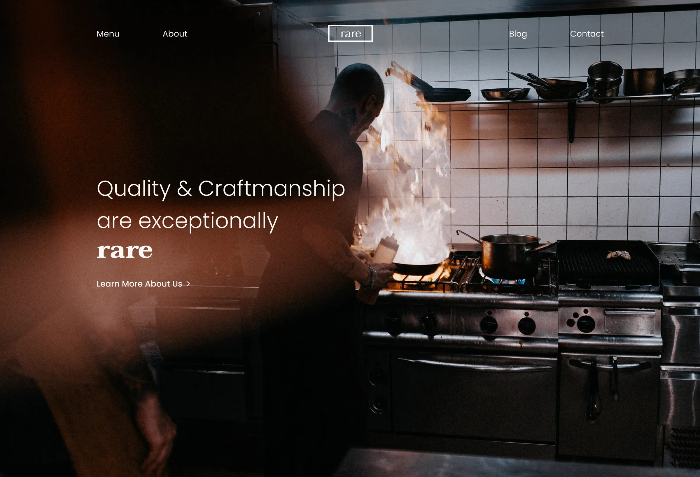
Decision 01
Double A contrast before anything fancy
The main challenge was keeping it elegant and accessible, which meant giving up fancy restaurant UI patterns. No glass, no abstract layouts that look clever and fail contrast. I aimed for at least double A on the real backgrounds (checked with the a11y audit) and leaned on patterns people already recognise.
Cream surface #FAF8F5, charcoal #2A3E46, slate #48555A. Peach, mint and powder blue only as full section tints. Sharp rectangles for primary buttons and text links with a chevron for secondary actions.
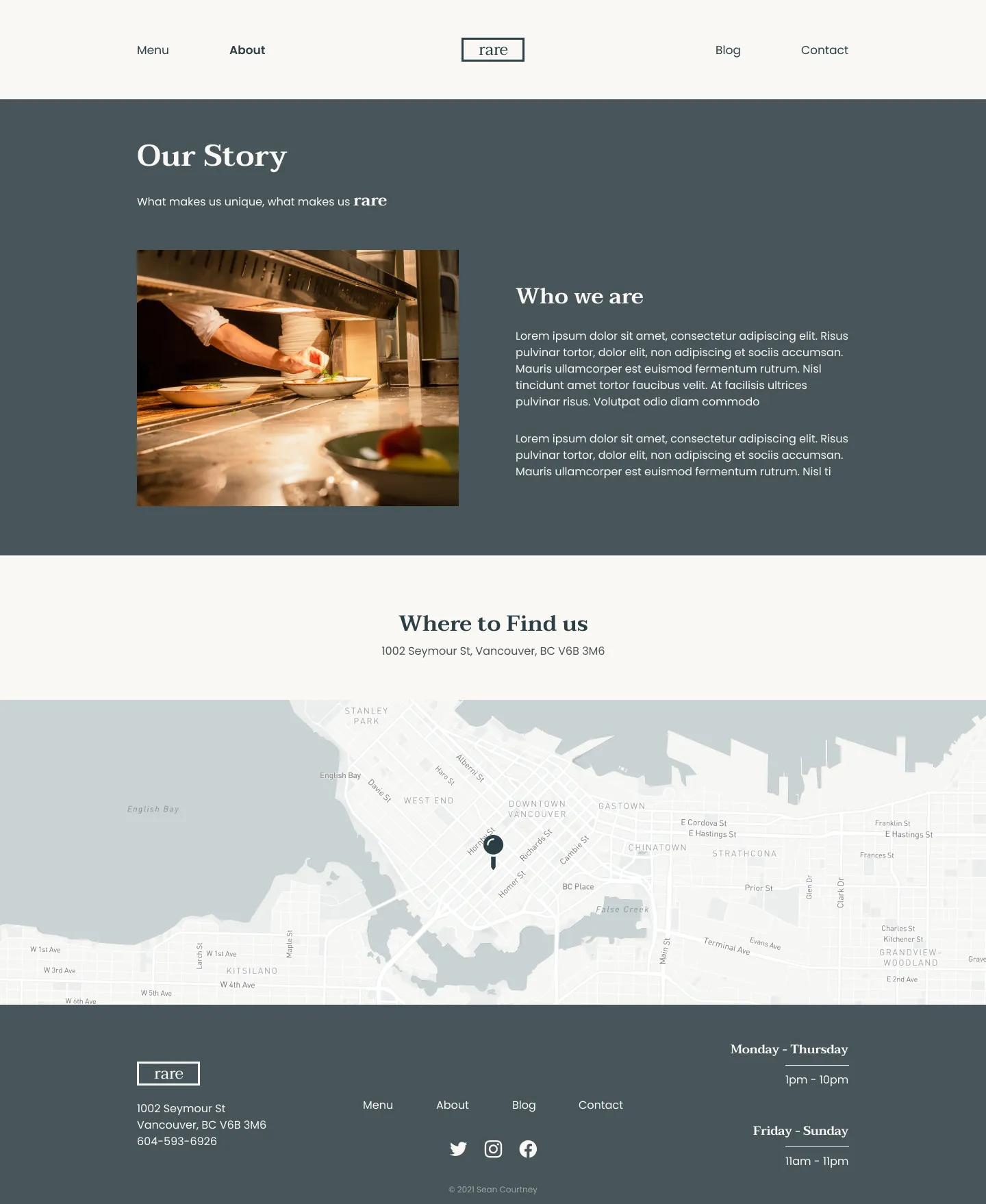
Decision 02
Two typefaces and a small UI library
Type locked early. Taviraj for H1 to H3 and Poppins for H4, body and captions. The serif carries the wordmark and page titles and the sans does the work on menus, forms and nav.
I kept the UI library small. Fill and outline primary buttons, secondary text links, one bordered input, and the boxed rare logo in light and dark. That was enough for all 6 pages without inventing a new control each time, and it's the part I'd reuse.
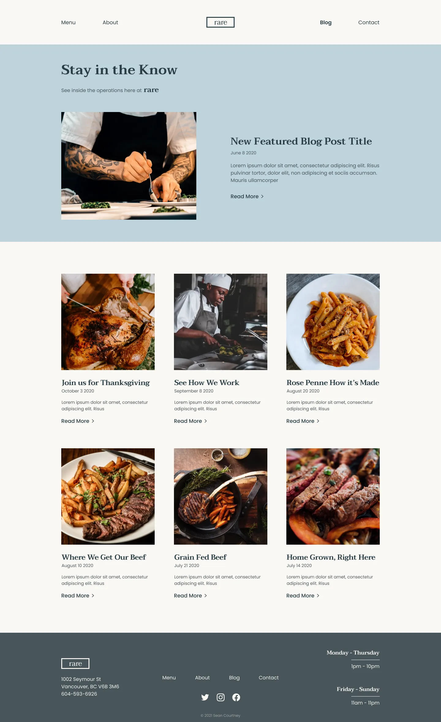
Decision 03
Blog and contact shipped, ordering didn't
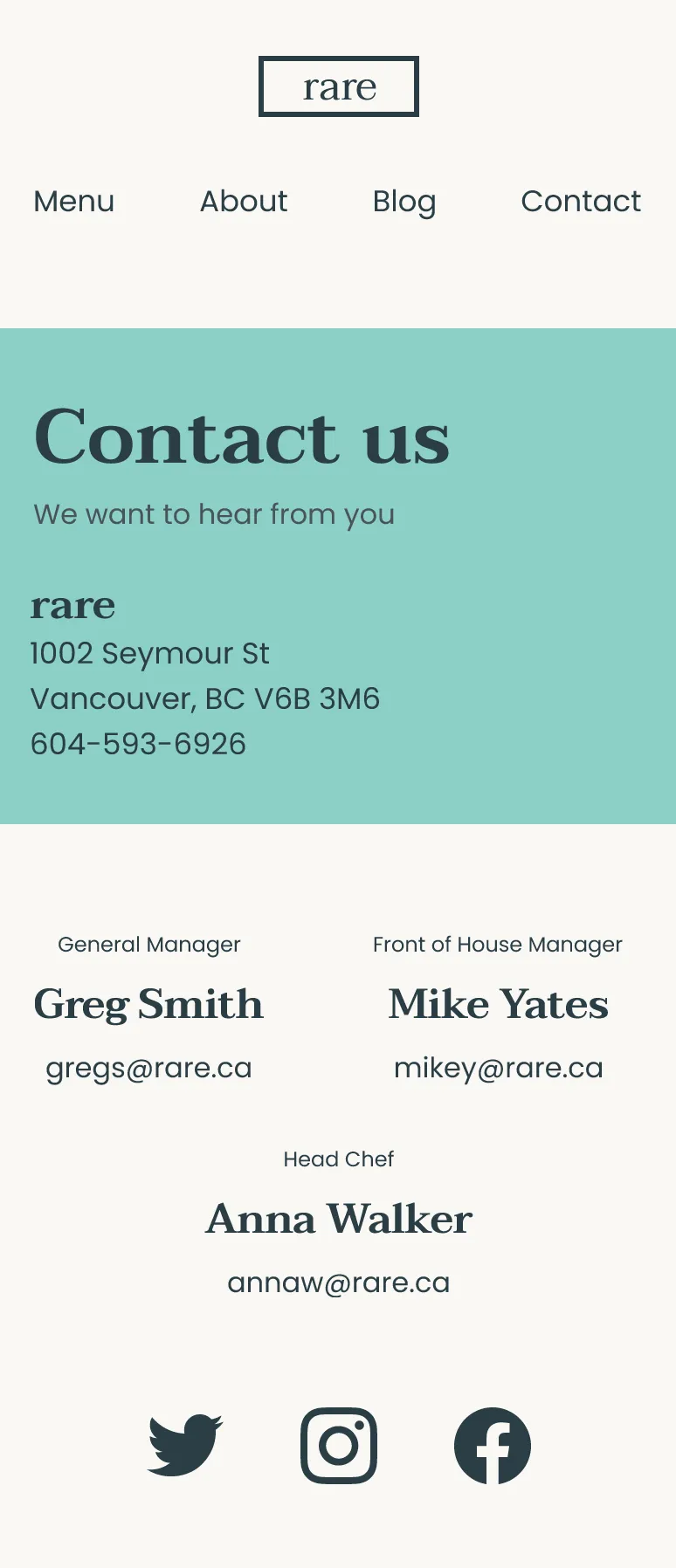
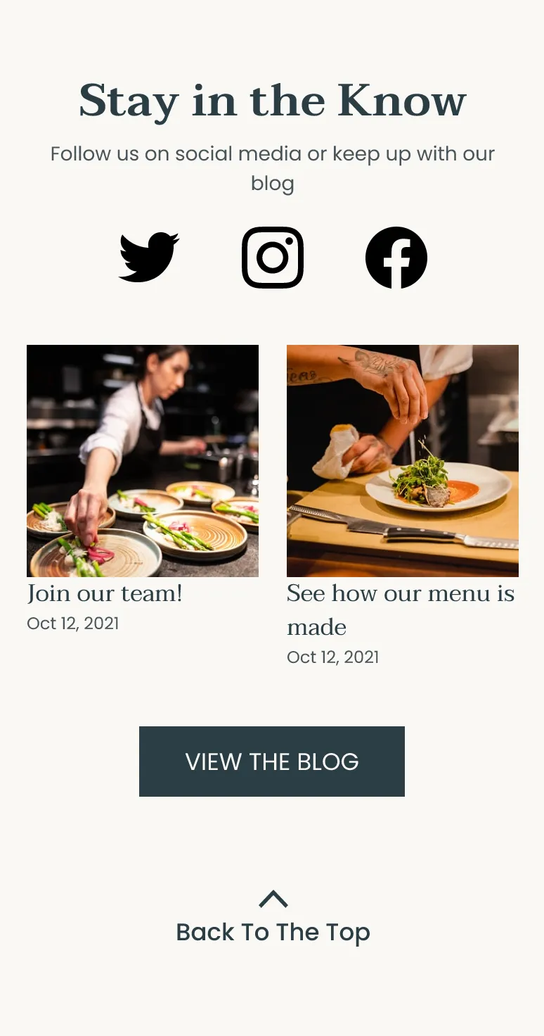
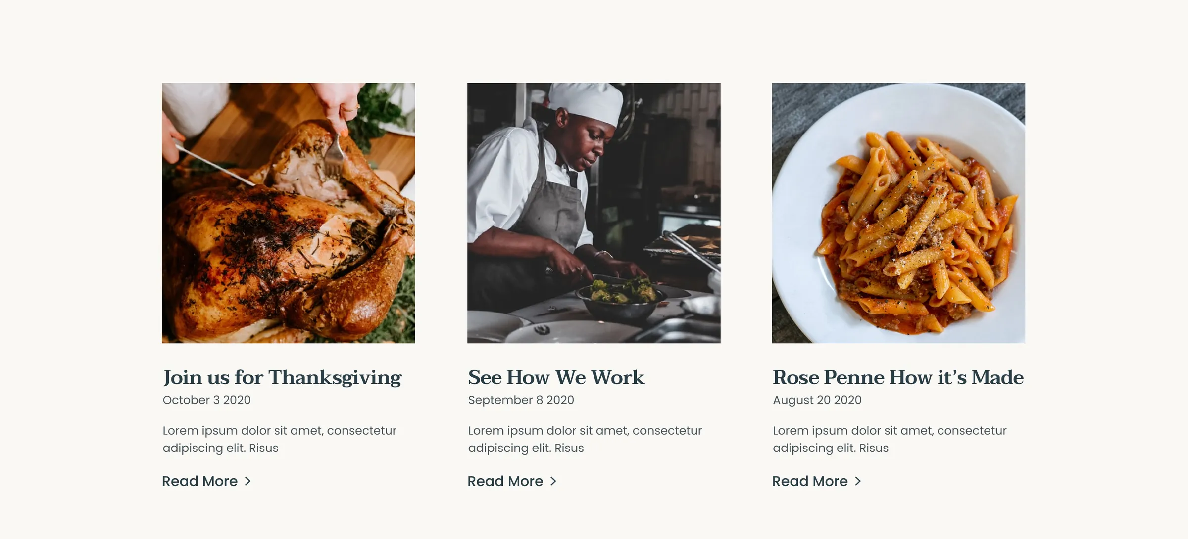
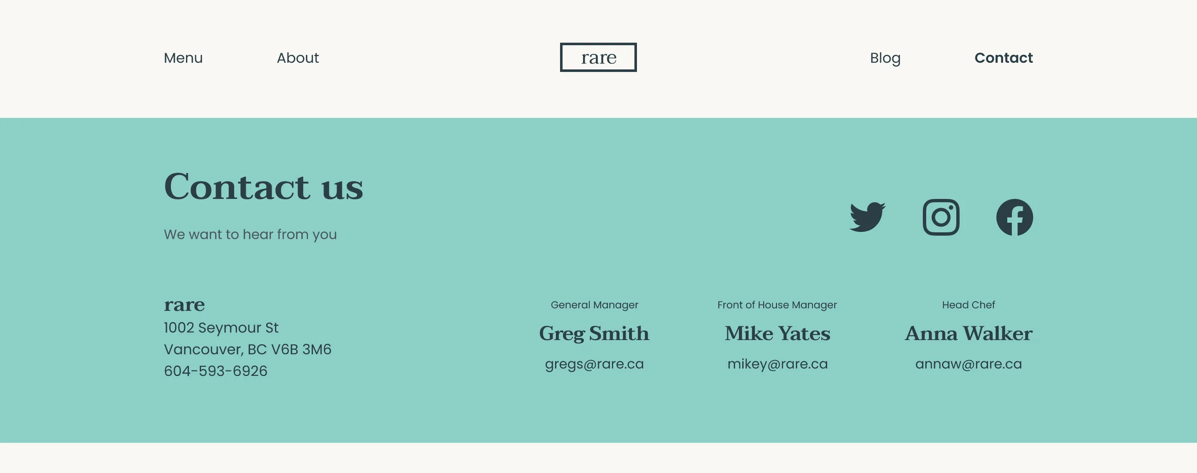
The brief asked for reservations and online ordering and I never got those flows into the hi-fi. What I did ship was the blog and events path plus a contact form, because I wanted to give people a reason to come back without calling the host stand.
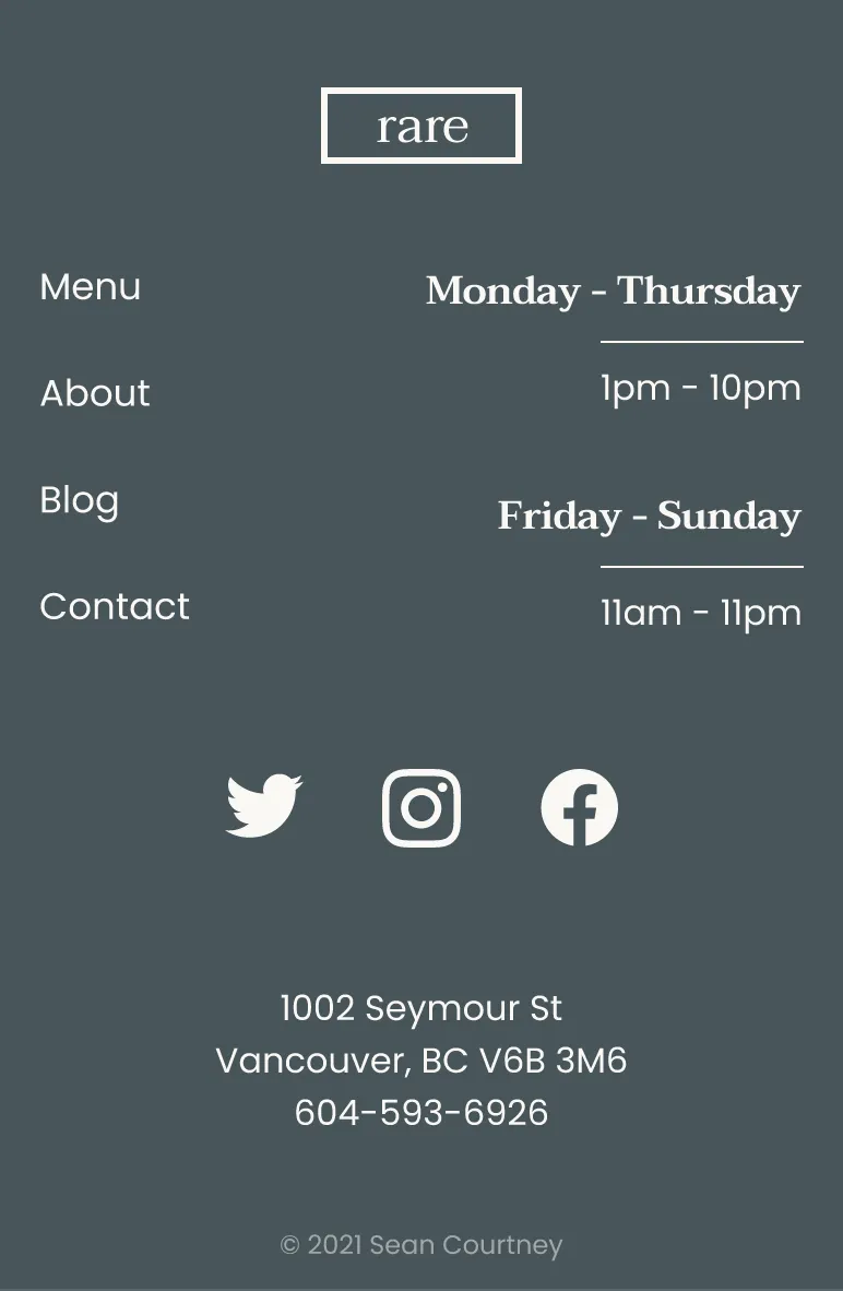
Looking back, hours and the address should have been higher on Home and on Find Us. That's what guests look for first and nice photography doesn't replace a phone number.
Interface shots
Desktop
Mobile
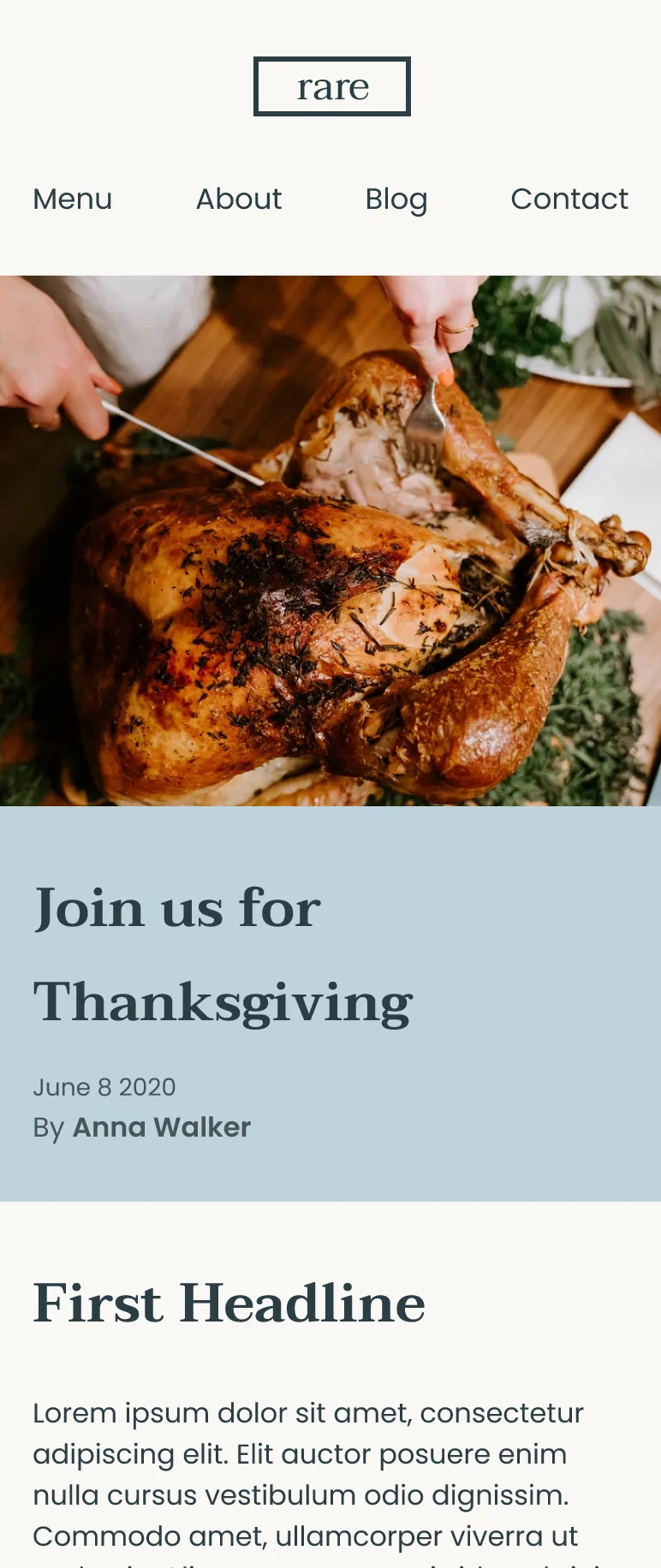
Sections
Outcomes
Twelve hi-fi screens and a style guide
Full page set in hi-fi
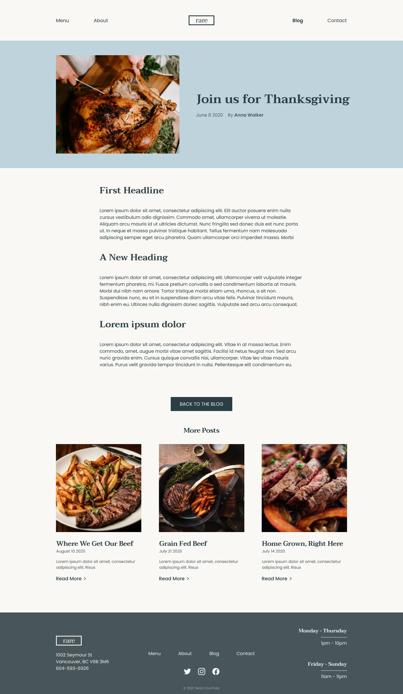
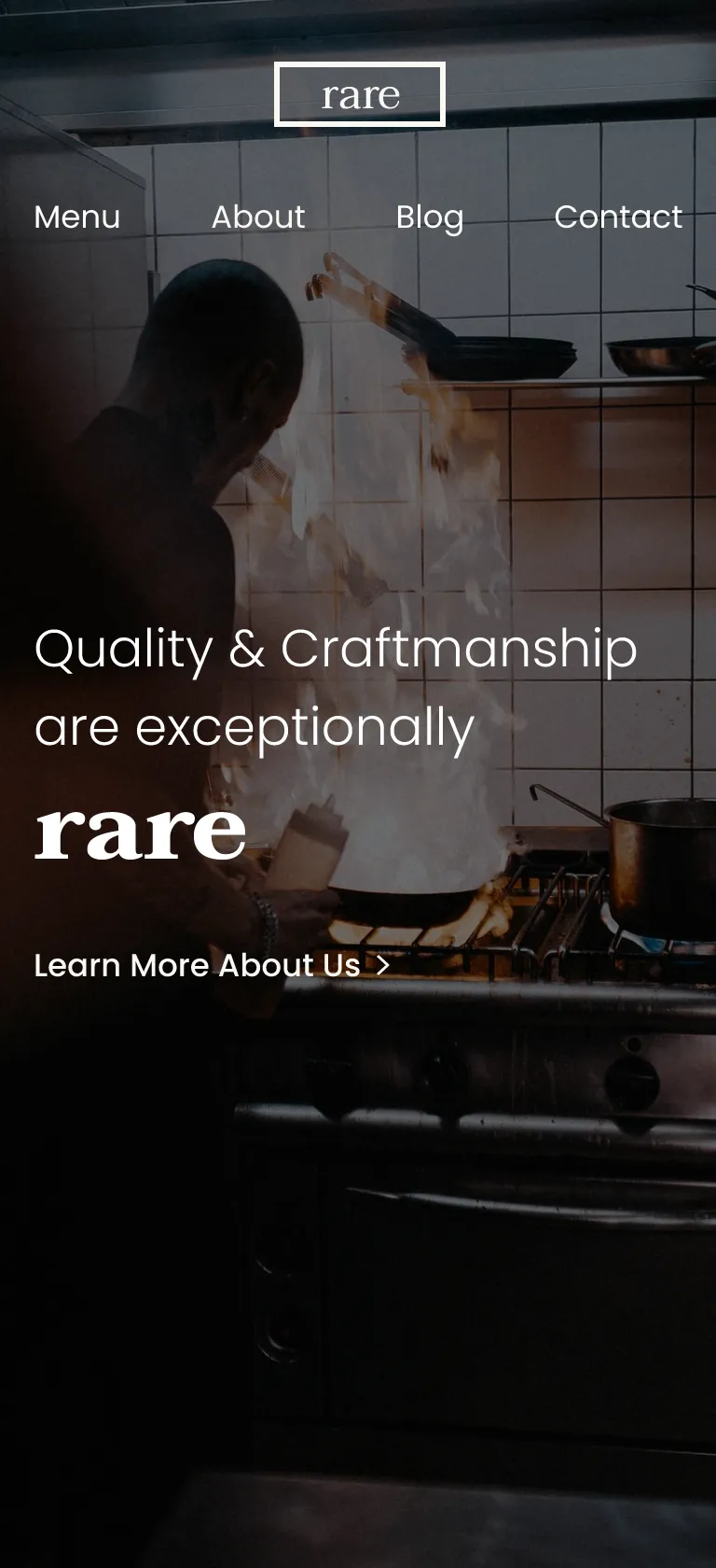
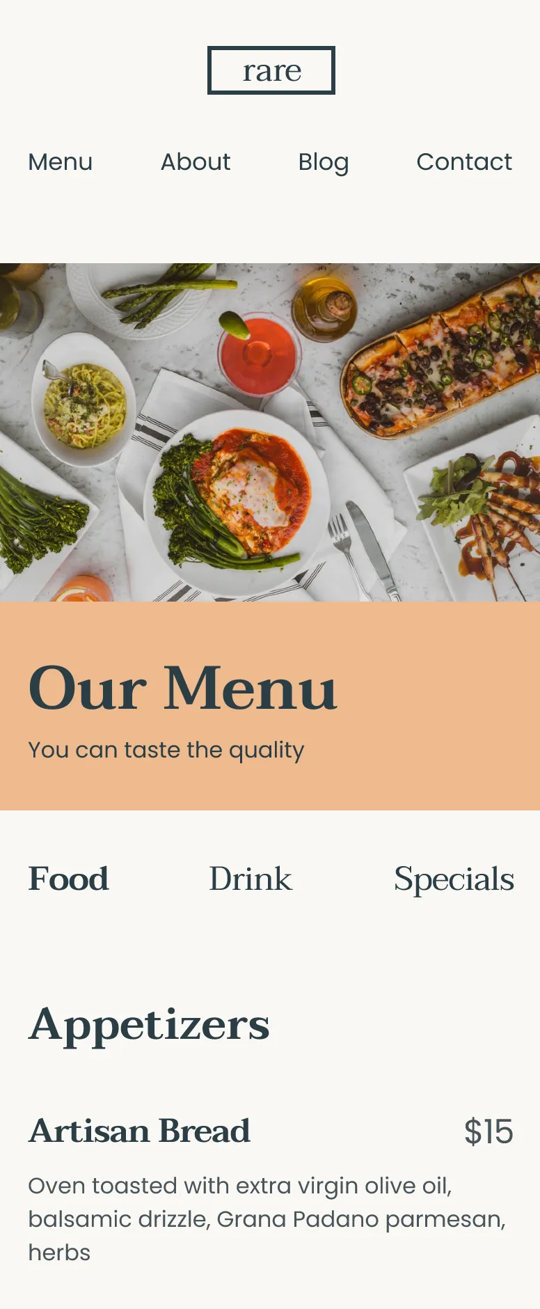
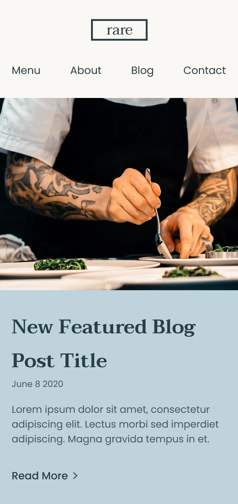
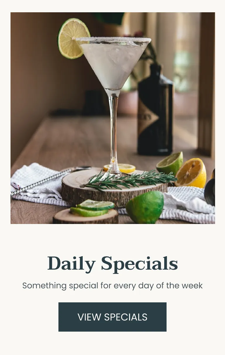
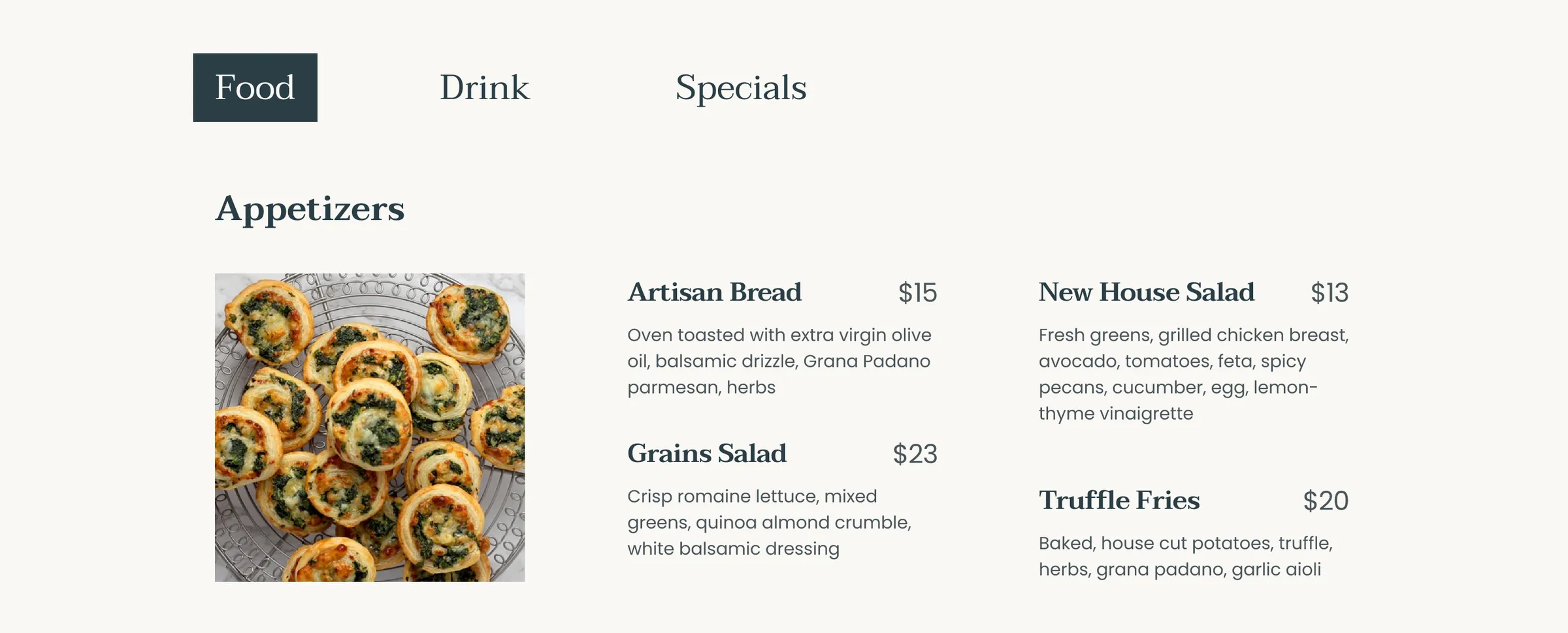
Home, Menu, About, Blog, Blog post and Contact, each at desktop 1440 and mobile 390. 12 screens total, plus clickable prototypes for both sizes.
Style guide before the screens
6 palette colours, 2 typefaces (Taviraj and Poppins), logo, buttons and form controls were all documented before the final screens.
Ordering, reservations and hours up front
Be a bit less generic, add ordering and reservations for real, and put opening hours and the address where hungry people look first.
Class project, not a live restaurant, so there are no booking metrics.
Reflection
More time on wireframes next time
Biggest takeaway was how valuable it is to plan and iterate early. Sketching and wireframing matter and I wish I'd spent more time there instead of jumping to hi-fi. I'd also push the brand further so it felt less generic, build ordering and reservations, and put hours and address where people look first.