
Designed in Figma, built by agents, shipped from main
This portfolio, end to end. I design every screen in Figma and Cursor agents port, rename, organise tokens and ship. Case study media uses five reusable frames, web, tablet, phone, phone-sm and tv.
Context and role
Context
A portfolio run like a product
This site is a product too. Home, Work, About, Contact, the case studies and the articles all start as Figma templates at web, tablet and mobile. The words live in JSON, Astro builds static HTML, and pushing to GitHub main deploys to Cloudflare Pages.
I wanted a portfolio I could redesign without waiting on myself to code it. So Cursor agents port the frames, wire the content and fix the CSS, and I keep the art direction, type, spacing and accessibility calls in Figma. When something looks wrong on the live site I fix it in Figma and the agent re-ports it.
Role
What I owned and what I delegated
Solo product and visual design in Figma. Templates, components, tokens, case study layouts, and the copy contract in content JSON. Accessibility and SEO stay on my checklist (one h1, real alt text, contrast, focusable controls).
Cursor agents do the Astro templates, CSS, content wiring, screenshots into assets, and shipping to main. If the UI drifts from Figma that's a bug and it goes back to the frame.
Numbers
What the system holds
100%
designed in Figma
Every public page starts as a Template frame
5
media frames
web, tablet, phone, phone-sm and tv in one LightboxMedia component
3
breakpoints
web 1440, tablet 834, mobile 402
1
designer
Agents help build. They don't invent the UI.
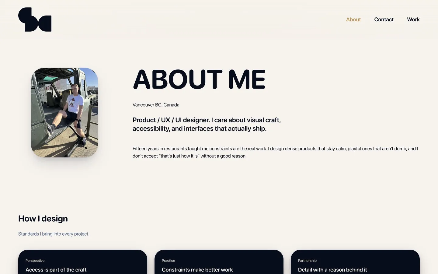
Decision 01
Web frame, 1440 desktop
Web is the desktop review surface. It matches the Figma Template/*/web frame at 1440 wide and it's for full pages and wide UI, never a phone screenshot stretched sideways.
Agents port from this frame first. If the live site drifts from the 1440 artboard, that's a bug in the port and the fix goes back to Figma, not into one-off CSS.
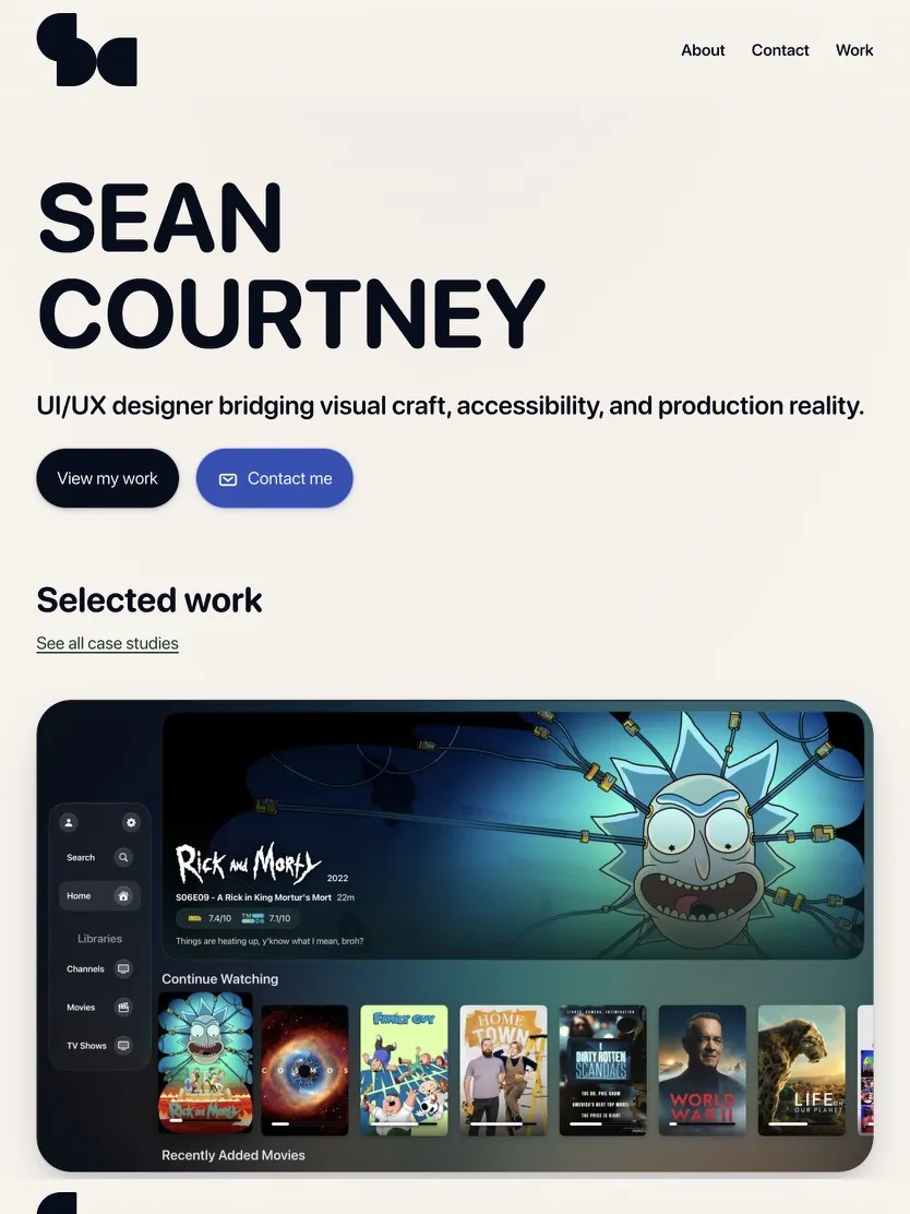
Decision 02
Tablet frame, 834 mid width
Tablet is the middle breakpoint at 834. Columns start to stack, type scales down and the nav still has room. It catches layouts that look fine at 1440 and fall apart before you get to a phone.
It uses the same LightboxMedia path as web. The JSON just sets frame to tablet, so there's no separate CSS for a third artboard size.

Decision 03
Phone frame, hero size
Phone is 402 wide and shows at hero scale. Hit targets, type size and single-column order all get checked here, one viewport and one nav.
The app case study heroes usually live in this frame. On this site it's there to prove the Template/*/mobile port, not to be a second design system.
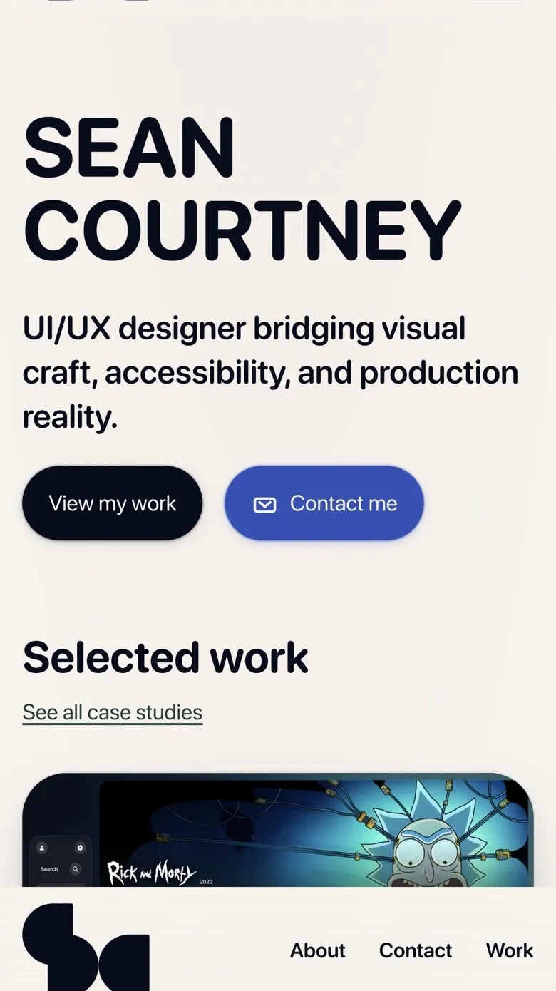
Decision 04
Phone-sm frame, decision size
Phone-sm is the same phone frame at decision-row size. Smaller shadow and a tighter width, so a row can hold copy beside the screenshot without the phone taking over the panel.
It's the default for decision shots when the JSON leaves frame out. Full phone is for when the screenshot is the point of the section.
Decision 05
TV frame, living room UI
TV is the wide living-room frame for the Apple TV case studies. Same LightboxMedia path as web with a different radius and shadow, so a 16 by 9 UI doesn't get squeezed into a phone bezel.
It's not a feature of this site, just a frame type. Screenshot held until I have a clean capture.
Outcomes
What the workflow changed
Five frames, one component
One LightboxMedia component covers web, tablet, phone, phone-sm and tv. Each case study says which frame a shot wants in JSON instead of getting its own CSS.
Who does what
Cursor handles ports, CSS fixes, content wiring and deploys. I handle art direction, accessibility, and deciding what ships.
Less time on Figma housekeeping
Tokens, renames and propagating a change across the Figma file go a lot faster with an agent, which leaves more time for the screens people actually look at.
Still iterating. New case studies ship the same way. Figma first, content JSON with a frame per shot, agent-assisted port, push main.
Reflection
What I kept and what I handed off
I still design every screen in Figma. Cursor does the port, the renames and the token cleanup, which is the part that used to stall me between a finished frame and a live page. When something looks wrong I open Figma and fix it there, and that's the part of the job I want to keep doing myself.