
Grow real food in a low-light apartment
Compact grow kit plus an app for Metro Vancouver apartments. No subscriptions, no locked pods. Kits from $79 to $169 with the app included.
Context and role
Context
The week 4 pivot to renters
Seedly is a compact indoor grow kit (shelf, lights, timer, starter supplies) with an app for setup and care reminders. It came out of a 12 week Business of Design course at ECUAD, idea to investor pitch. We started with Vancouver families. By week 4 interviews and kit size pushed us to renters aged 24 to 40 in dense Metro Vancouver, no yard and not much light.
People were interested, and scared of wasting money on gear they didn't understand. Competitors each fix one part and create another, locked pods, subscriptions, or weak support after the sale. Pricing and setup had to stay plain. What it costs, what you do next, and what happens when a plant dies.
Role
Lead on product, hardware and brand
I was lead and product owner on a team of 3. Product, hardware (the shelf and lighting), brand direction and most of the UI. Natasha did app UX and kit research. Yuki did brand and market research. Native iOS and Android for MVP because push reminders and on-phone setup mattered more than a responsive site.
Constraints were apartment footprint, beginner confidence, and a hard line against predatory subscriptions. Gardyn, Click and Grow and AeroGarden mostly told us what not to copy.
Numbers
Prices and who it's for
$79
Small kit
App included, no subscription
$119
Medium kit
Open seed system, use your own seeds
$169
Large kit
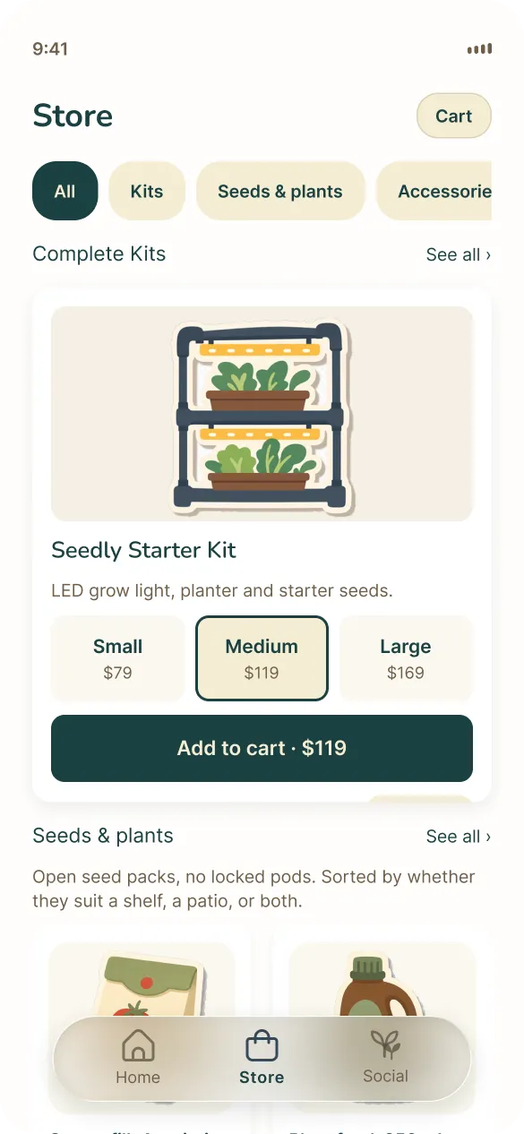
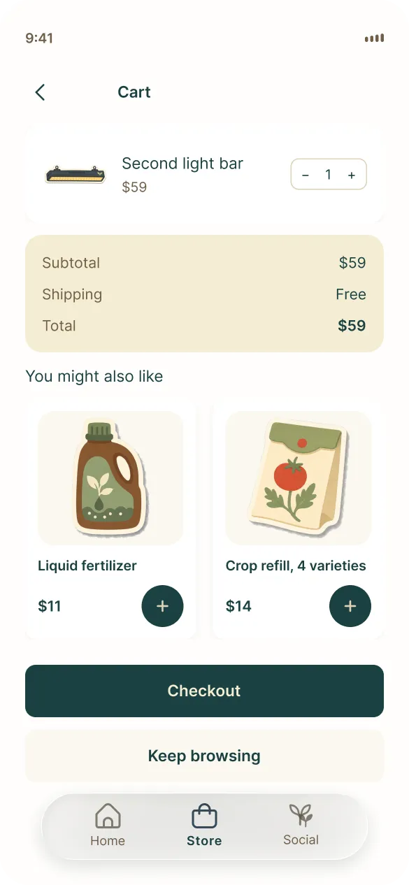
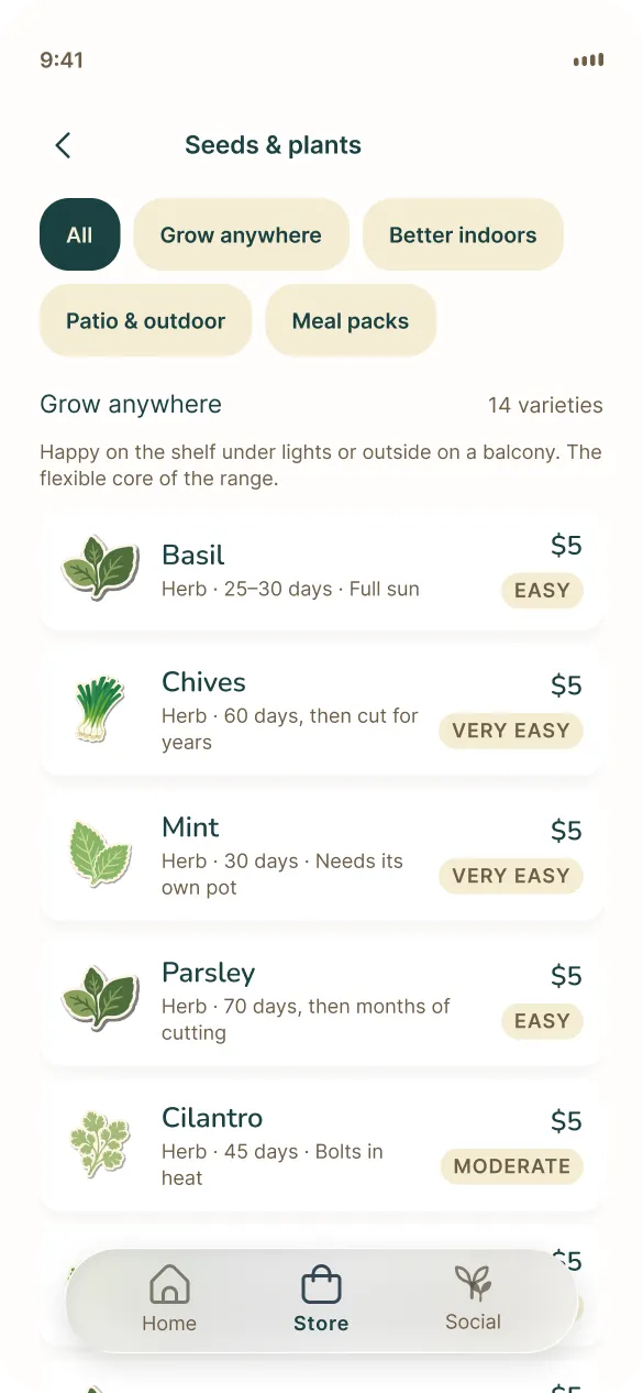
Seed packs $14, fertilizer $11, free kit shipping
24 to 40
target renters
Metro Vancouver, after the week 4 pivot
Decision 01
No subscription, no locked pods
Gardyn charges about $408 a year on top of the hardware and Click and Grow locks you into their pods. Reviews and interviews both named that as why beginners didn't trust any of it. In week 2 we dropped the premium app tier and subscription refill packs. Revenue is kit sales, optional seasonal bundles and hardware upgrades. The app is included and stays fully functional.
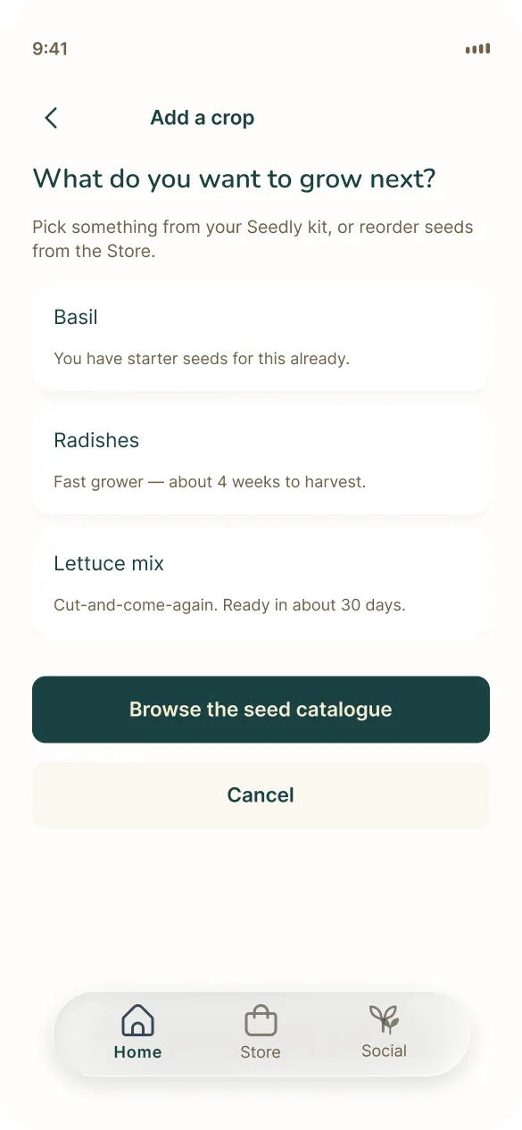
Open seed system so you can use your own seeds. Refills are one-off or seasonal, never forced. Small $79, Medium $119, Large $169, seed pack $14, free kit shipping. No monthly bill means people can stick with it.
Decision 02
Reminders instead of sensor graphs
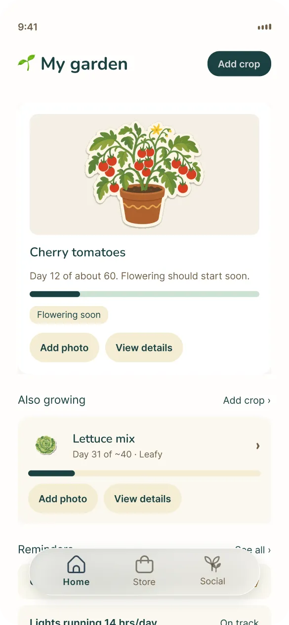
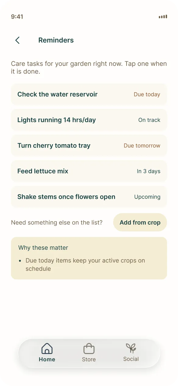
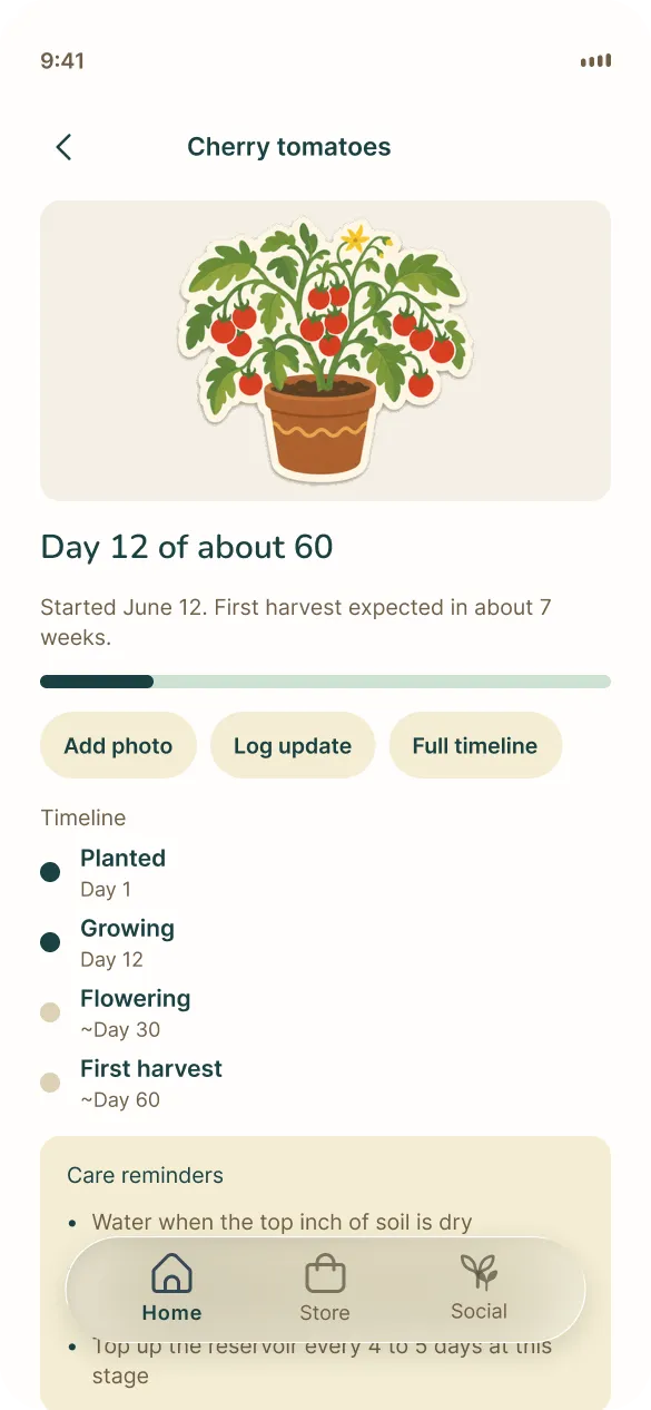
Early UX leaned toward a smart garden control centre with sensor graphs. Beginners don't need that, they need "what do I do next?" In week 6 we rebuilt around guided growth, reminders and a simple Home. Gardyn-style AI monitoring stayed out of scope.
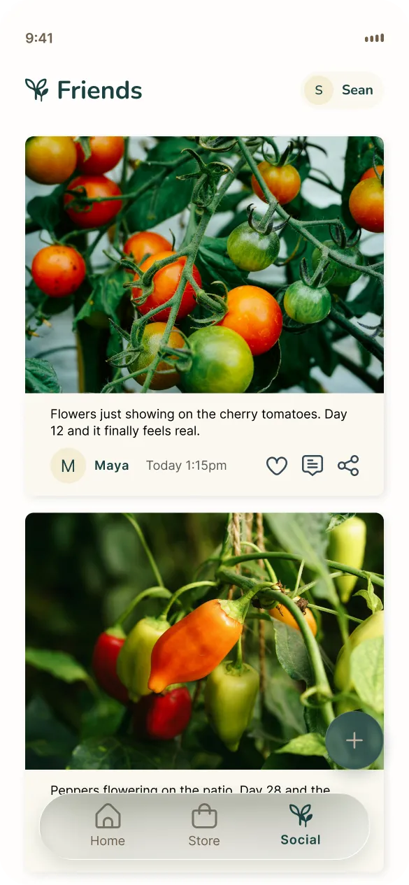
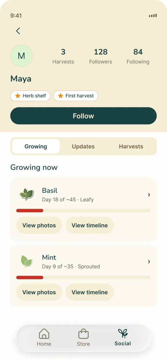
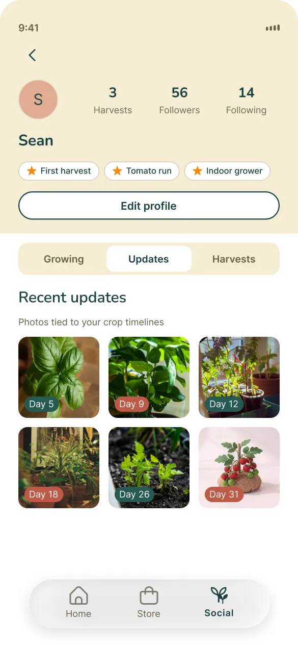
MVP is onboarding, Shop, Support and light growth reminders. Community got pushed past MVP in week 7 since neither Click and Grow nor AeroGarden ship one at launch, and it wasn't why someone bought a kit. The live tab bar is Home, Store and Social, with growth folded into Home.
Decision 03
Neighbour voice, then four critical bugs
The first pass at the brand voice was playful and cheeky and it read as cringe for renters in their late twenties and thirties. In week 8 we rewrote it as a knowledgeable neighbour who composts. Plain language, practical advice, friendly without trying too hard. Warm forest and cream instead of gadget gloss.
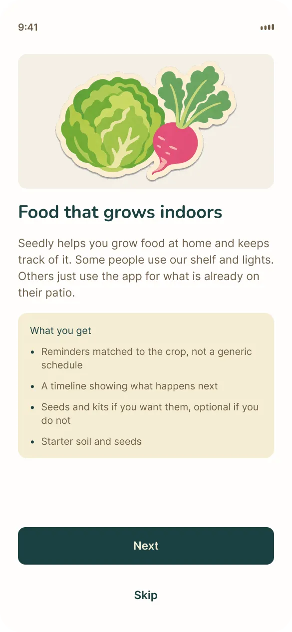
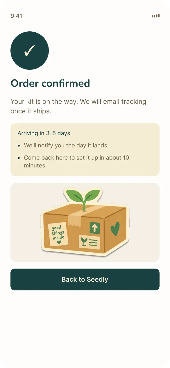
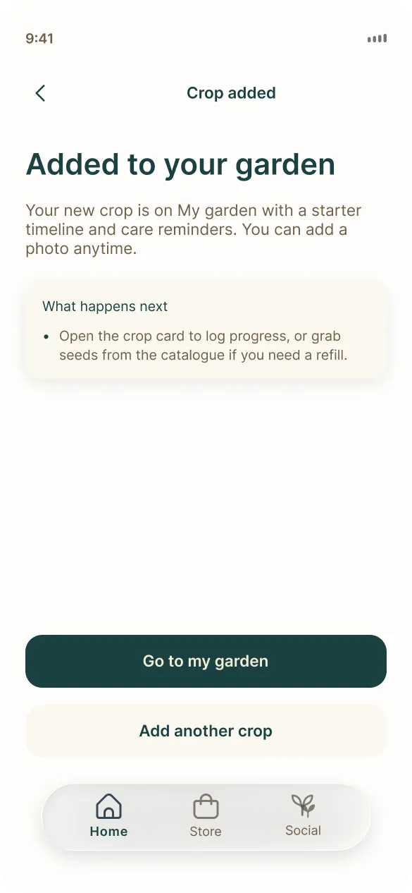
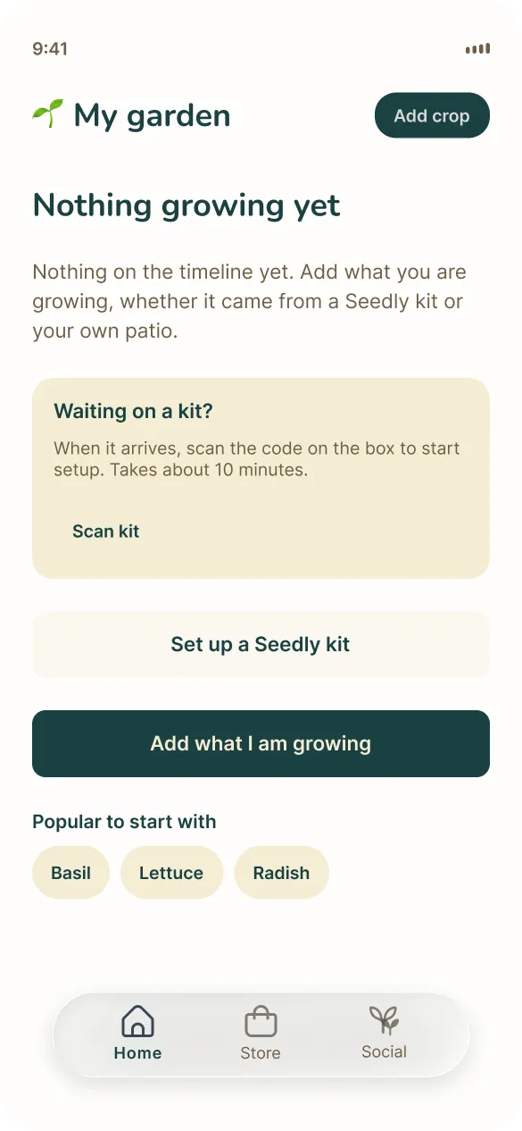
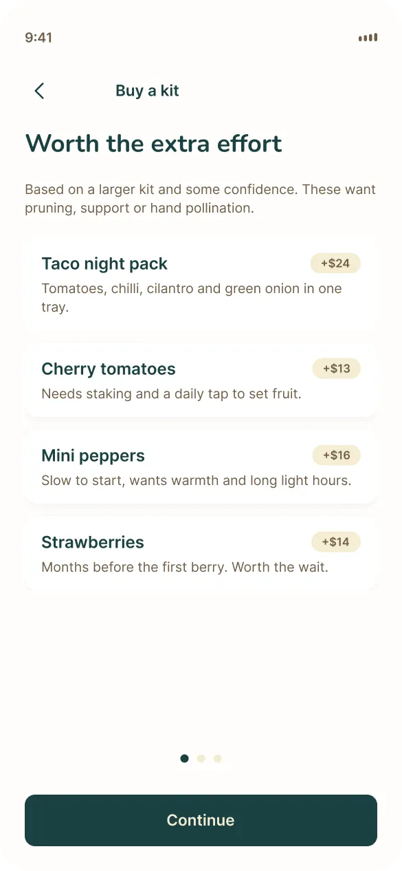
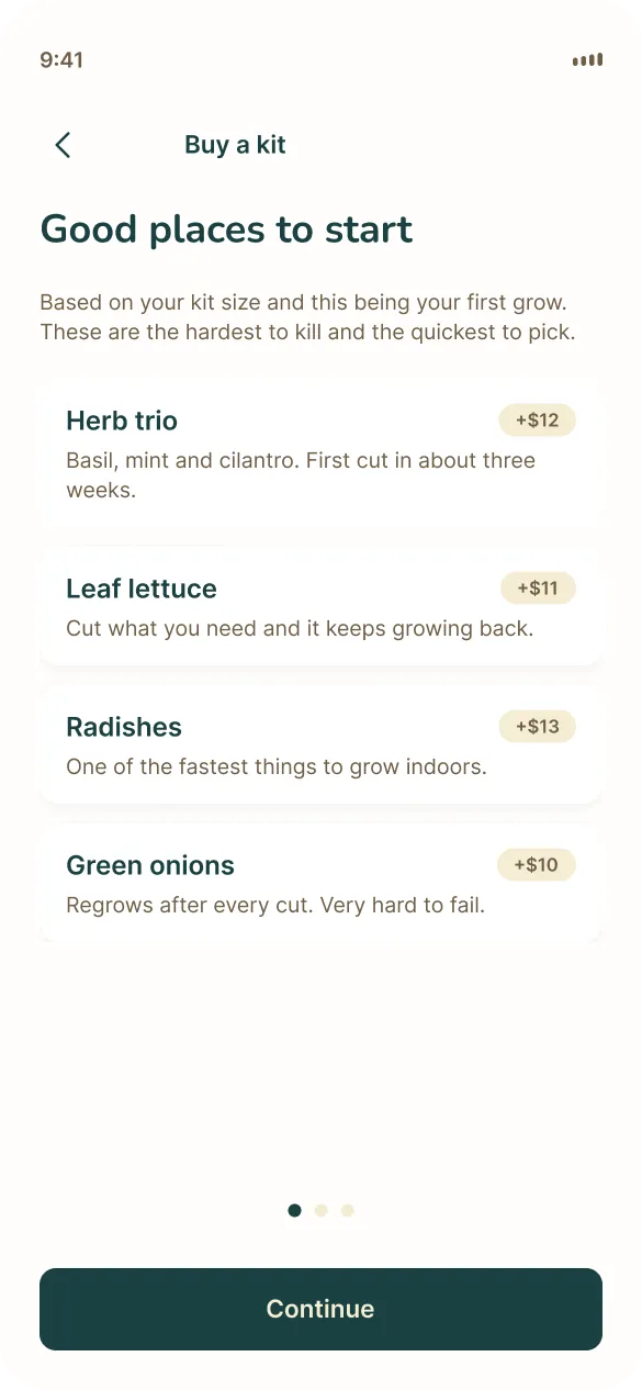
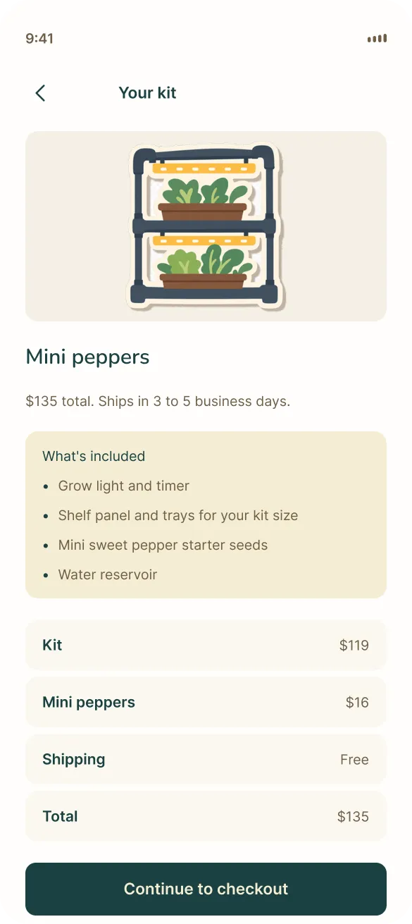
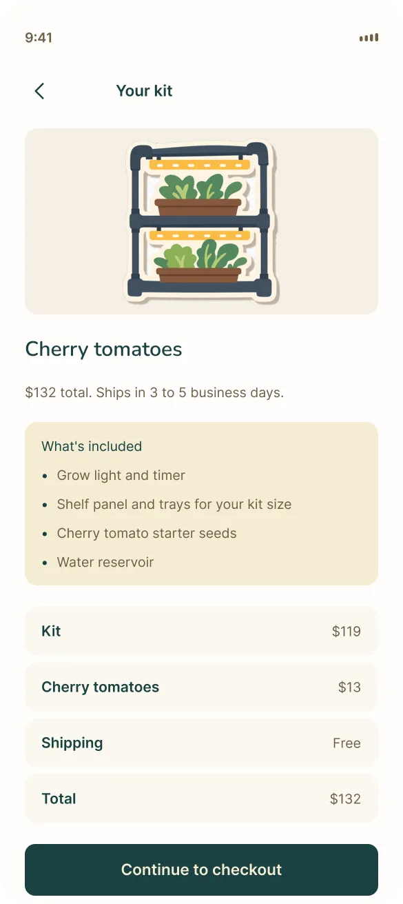
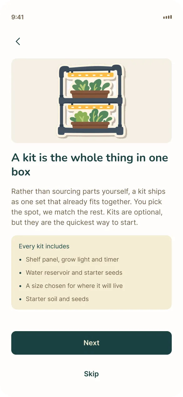
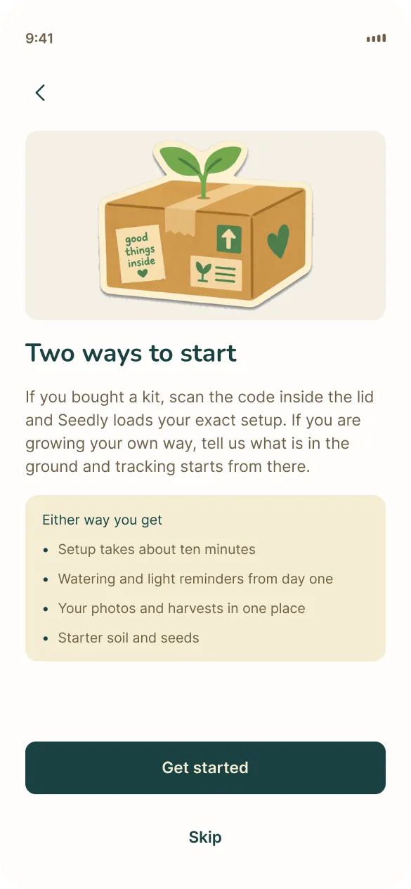
Before the pitch, a persona walkthrough with 5 passes, ages 24 to 38, found 4 critical problems. The buy flow ignored onboarding and landed everyone on the Medium kit with cherry tomatoes, Home had no empty state, there was no checkout, and the cart held only one kit. We fixed 71 prototype links, added checkout and an empty Home, built a second onboarding branch, and made the $14 seed pack purchasable.
Interface shots
Home
Onboarding
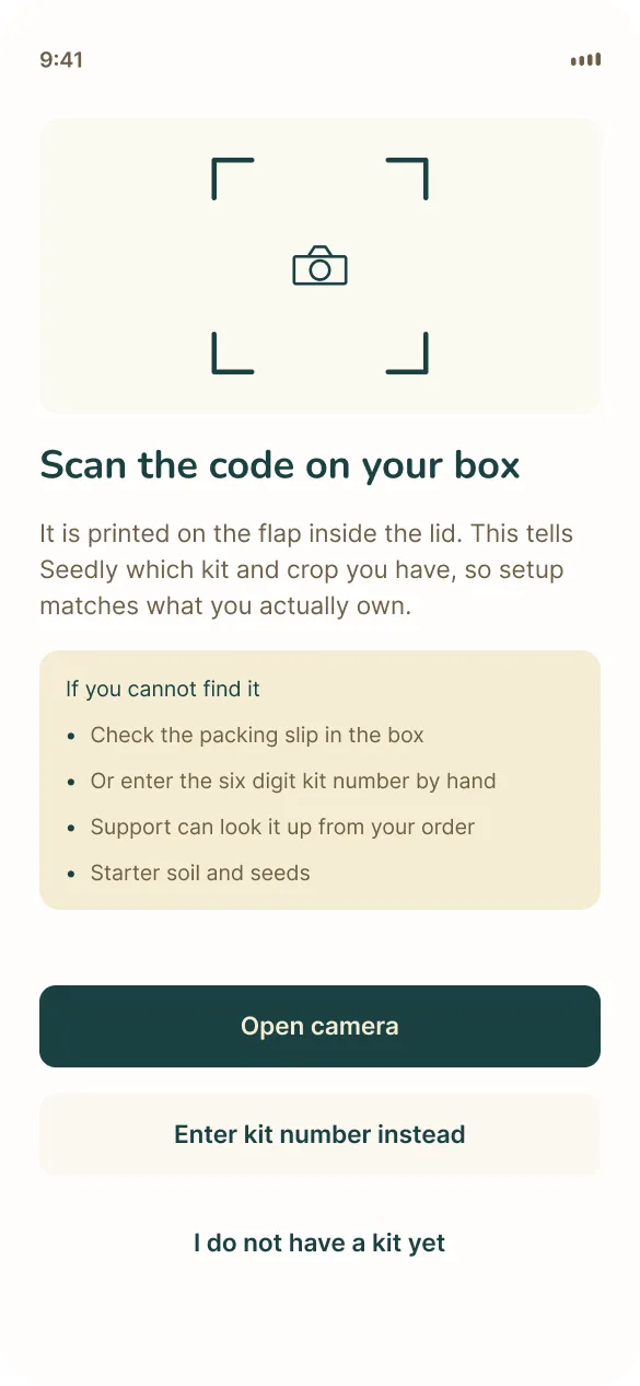
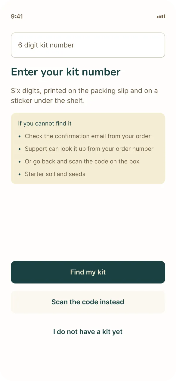
Social
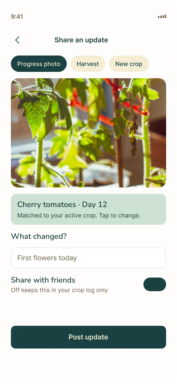
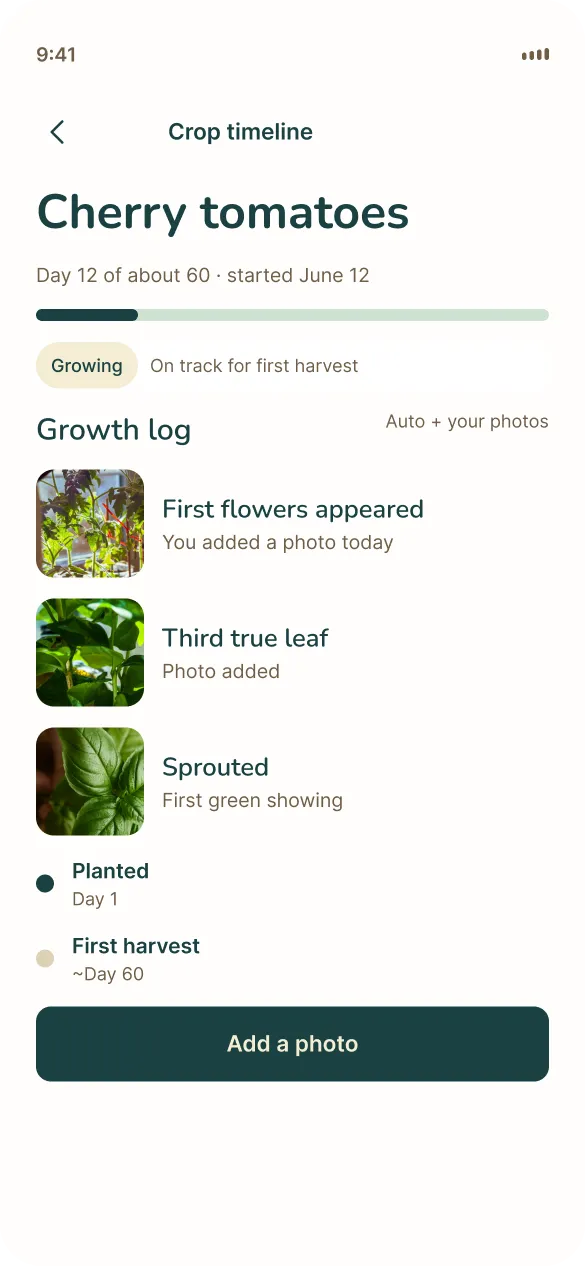
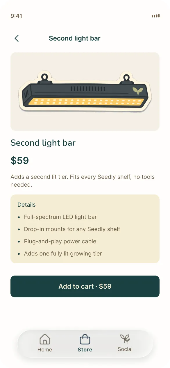
Store
Outcomes
Pitch-ready kits without a subscription
Revenue without a subscription
One-time kits at $79, $119 and $169 with optional seasonal refills and hardware upgrades. App included, no tiers, free kit shipping.
Audience pivot held
Primary persona is eco-conscious renters 24 to 40 in dense Metro Vancouver. Jordan the beginner is the launch persona, Maya the experienced grower in a north-facing condo is secondary.
Home tells you what to do next
Care reminders and next steps replaced the sensor dashboard. Home tells a beginner what to do today, and after the walkthrough it also has something to show someone who skipped setup.
No live product yet. What we'd measure is kit attach rate for the app, reminder completion, refill repurchase, and whether people recommend Seedly without paid ads.
Reflection
Most of it was cutting revenue ideas
Kits at $79, $119 and $169 with the app included beat a subscription garden for the people we talked to. I owned product and hardware, so pricing and the shelf were mine, and most of the work was cutting revenue ideas that looked fine in a deck and wrong in a one-bedroom. The other lesson was the walkthrough. Five people found four critical bugs in a prototype we thought was done.